Telerik is a tool built for creating UI frameworks in a variety of platforms.
I recently developed a .NET application at DMC which used Telerik’s WPF tools for graphing live data to the user interface.
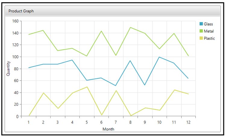
This blog will walk you through the creation of the graph below. Refer to Using Telerik Graphing in .NET: Tips and Tricks for more best practices.
Recommendations
- Start populating your graph with dummy data that you have hard coded! It will make debugging much easier.
- Don’t be concerned if some of the items don’t auto-populate in the XAML viewer like you expect them to.
- When you are searching for help content, be sure to include the type of Telerik API that you are using. For example, Telerik UI for WPF.
Start Development Of A Telerik Graph
Create a RadTileViewItem which will allow you to include multiple Telerik items in one region.
You can then set up a grid which will allow you to place the Telerik items in desired sizes and locations. This example will just be implementing a RadLegend and a RadCartesianchart.
<telerik:RadTileViewItem Header="Product Graph">
    <Grid>
        <Grid.ColumnDefinitions>
            <ColumnDefinition Width="*"/>
            <ColumnDefinition Width="75"/>
        </Grid.ColumnDefinitions>
Set Up The Framework For Your Chart
The Main content area of your graph will be contained in a RadCartesianChart.
You can specify the color that you would like to use for all of your graph items by selecting a Palette. The options for this field will not auto-populate, but you can find all available palette’s on Telerik's website.
<telerik:RadCartesianChart x:Name="chart" Grid.Column="0" Palette="Summer">
Set Up The Graph Legend
Set up a legend which binds the LegendItems and refers to an ElementName which is the name of your graph. Don’t be concerned if some of the items don’t auto-populate like you expect them to! I’d recommend running the software to determine if something you have added is hooked up properly.
<telerik:RadLegend Grid.Column="1" Margin="10" Name="Legend" Items="{Binding LegendItems, ElementName=chart}"/>
Format Your Graph Region: Axes And Gridlines
The Cartesian Chart allows you to specify which grid lines should be shown. You also have the ability to configure X and Y grid lines appearance independently.
You will notice that the horizontal axis is configured as a CategoricalAxis, whereas your vertical axis is configured as a LinearAxis. This is intentional! A CategoricalAxis will allow you to display text (like month names instead of just month numbers) along an axis.
<telerik:RadCartesianChart.HorizontalAxis>
    <telerik:CategoricalAxis Title="Month"/>
</telerik:RadCartesianChart.HorizontalAxis>

<telerik:RadCartesianChart.VerticalAxis>
    <telerik:LinearAxis HorizontalAlignment="Right" Title="Quantity"/>
</telerik:RadCartesianChart.VerticalAxis>

<telerik:RadCartesianChart.Grid>
    <telerik:CartesianChartGrid MajorLinesVisibility="XY"/>
</telerik:RadCartesianChart.Grid>
Populate Your Chart With Data – Series
For this example, we will bind to a collection of data that was initialized within the View Model. This is, of course, only for the purposes of this example. The ItemsSource in this example should be bound to a single collection of ProductSales data.
The Category Binding should be the data that you want to display on the x-axis and the Value Binding should be the data that you want to display on the y-axis. Using the Legend Settings, you can also define what you would like this series to be labeled in the Legend.
You can add as many Line Series items as you like within a Cartesian Chart Series by just duplicating this piece of code. Have a lot of items? See *link to tips and tricks* which shows you another way to populate data into a chart using a Series Provider.
<telerik:RadCartesianChart.Series>
    <telerik:BarSeries ItemsSource="{Binding TestCollection}" CategoryBinding="Month" ValueBinding="Quantity">
        <telerik:BarSeries.LegendSettings>
            <telerik:SeriesLegendSettings Title="Plastic"/>
        </telerik:BarSeries.LegendSettings>
    </telerik:BarSeries>
</telerik:RadCartesianChart.Series>
Full Code
Conclusion
Telerik UI for WPF has features for data management, data visualization, editors, file upload and management, interactivity & UX, layout, media, navigation, and scheduling.
Learn more about DMC's .NET Application Development services