


When an Ignition Perspective view takes a moment to load, a blank area can make the page feel unfinished or broken, even if everything is working normally.
A loading skeleton solves that by showing a placeholder version of the content before the real data loads. Instead of staring at an empty space, the user sees the shape of the card, chart, or widget that is about to appear.
In this post, I will show a straightforward way to build a shimmer loading skeleton in Ignition Perspective using a lightweight skeleton view, a loading Boolean, and a custom style class in the project stylesheet. No JavaScript or custom module is needed.
What We are Building
- Create a normal embedded view for the real content.
- Create a second embedded view that is structurally identical but uses placeholder components instead of real data.
- Apply the shimmer-style class to those placeholder components.
- Toggle between the real view and the skeleton view using a loading Boolean.
This works well for KPI cards, summary widgets, charts, tables, and other dashboard elements.

Step 1: Create a Skeleton Version of the View
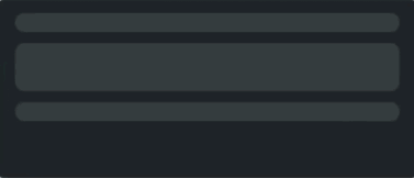
Start with your normal view. For example, suppose you already have a card view called MetricCard. Create a second version of it called MetricCardSkeleton.
The skeleton version should keep the same overall layout as the real one: the same containers, spacing, padding, alignment, and approximate component sizes.
The goal is not to redesign the card. The goal is to make a lightweight placeholder that occupies roughly the same space as the real content.
For example, if the real card includes a title, a large OEE number, and a small subtitle, the skeleton version should include placeholders in the same locations.

Step 2: Use Static Placeholder Text for Sizing
For text-based placeholders, I used normal Label components and applied a custom style class to them.
The label text itself is just there to help with spacing and sizing. It does not need to be meaningful, and it should not be bound to live data.
For example, if the actual OEE typically shows 47.7%, the skeleton label might simply show 88.8%. That gives the label a realistic width and height while keeping the skeleton lightweight.
The same idea applies to titles. You might use a short static label value just to preserve the shape of the final layout.

Step 3: Add a Loading Boolean
This is the part that makes the whole pattern actually usable.
You need some Boolean value that tells Perspective whether the real content is ready yet. A simple example would be view.custom.isLoading.
Set that Boolean however it makes sense for your view. Common options include setting it true until a query returns, until required params are present, until a custom property is populated, or until a dataset or object has usable data.
For a simple setup, isLoading should be true while the data is not ready and false once the data is ready.
Then bind visibility like this:
- Real view visible when
!view.custom.isLoading - Skeleton view visible when
view.custom.isLoading
This makes the skeleton show first, then disappear once the real content is ready.
Step 4: Add a CSS Shimmer Style Class in Perspective
In Perspective, style classes can be created in the project stylesheet. I used a single general-purpose class for shimmer text placeholders.
:root{
  --sk-base:   #FFFFFF1A;
  --sk-radius: 8px;
  --sk-clear:  #FFFFFF00;
}

@keyframes shimmer {
  from { background-position: 200% 0; }
  to   { background-position: -200% 0; }
}

.psc-skeletonTextShimmer {
  background:
    linear-gradient(
      90deg,
      var(--sk-clear) 0%,
      var(--sk-clear) 35%,
      var(--sk-base) 50%,
      var(--sk-clear) 65%,
      var(--sk-clear) 100%
    ),
    var(--sk-base);
  background-size: 200% 100%;
  background-repeat: no-repeat;
  border-radius: var(--sk-radius);
  min-height: 14px;
  animation: shimmer 1.4s ease-in-out infinite both;
  color: #FFFFFF00;
  user-select: none;
}A quick Ignition-specific note: if your Perspective style class is named skeletonTextShimmer, the selector in the stylesheet needs the .psc- prefix: .psc-skeletonTextShimmer.
For a deeper dive into this code, see the section How the CSS Works.
Step 5: Apply the Style Class to Placeholder Labels
In the skeleton view, apply the style class to the labels you want to shimmer.
props.style.classes = skeletonTextShimmerYou can keep normal label styling for things like:
- font size
- font weight
- margin
- padding
- alignment
The text itself becomes transparent due to CSS, but the label retains its size and layout behavior. That is what makes this pattern so convenient: you are still working with ordinary Perspective components, just styled to look like placeholders.
Tip: If the shimmer does not appear right away in the Designer, try closing and reopening the view.

Step 6: Show the Skeleton While the Real View Loads
A simple and maintainable way to do this is to use two embedded views in a parent container: one embedded view for MetricCard and one embedded view for MetricCardSkeleton. Then bind each view’s visible property to your loading Boolean.
Skeleton embedded view:
visible = view.custom.isLoading

Real embedded view:
visible = !view.custom.isLoadingThat gives you a very readable setup: when loading is true, show the skeleton; when loading is false, show the real widget. This is often easier to maintain than trying to make one view serve both purposes.
Why This Works Well
This pattern gives the user immediate visual structure instead of a blank area.
It also reduces layout shift because the skeleton uses the same approximate spacing as the real content.
Just as importantly, it stays simple. You are not adding much scripting or frontend complexity. You are duplicating the layout, replacing live content with static placeholders, toggling visibility with a Boolean, and using one reusable CSS class.
A Few Practical Tips
Keep the skeleton lightweight: Do not bind the placeholder labels to live data. Their job is just to hold space and show the shimmer effect.
Match the real layout closely: The closer the skeleton matches the final card, the smoother the transition feels.
Use realistic placeholder lengths: For percentages, use something like 88.8%. For short titles, use placeholder text of similar length. That helps preserve spacing.
Hide overflow if needed: If a placeholder label could get awkwardly sized, setting overflow-related text styling can help keep the skeleton clean.
How the CSS Works
If you mainly want the implementation, you can stop after applying the class and wiring up the loading Boolean. If you are curious about how the shimmer works, here is the breakdown.
Root Variables
:root{
  --sk-base:   #FFFFFF1A;
  --sk-radius: 8px;
  --sk-clear:  #FFFFFF00;
}These are reusable values for the skeleton effect.
--sk-baseis the main placeholder color--sk-radiuskeeps the skeleton corners rounded--sk-clearis a fully transparent color used inside the shimmer gradient
Using CSS variables makes it easier to tweak the look later without rewriting the whole class.
Keyframe Animation
@keyframes shimmer {
  from { background-position: 200% 0; }
  to   { background-position: -200% 0; }
}This animation moves the background image from right to left.
The shimmer effect is not a separate moving object. It is just the background gradient sliding across the component over time.
The Background Layers
background:
  linear-gradient(
    90deg,
    var(--sk-clear) 0%,
    var(--sk-clear) 35%,
    var(--sk-base) 50%,
    var(--sk-clear) 65%,
    var(--sk-clear) 100%
  ),
var(--sk-base);There are two background layers here:
- A
linear gradient(…) that creates the moving shimmer band - A solid var(
--sk-base) layer underneath it
The gradient is mostly transparent, with a slightly visible band in the middle. As it moves, that band creates the shimmer effect.
Background Size and Repeat
background-size: 200% 100%;
background-repeat: no-repeat;
background-size makes the animated gradient wider than the component itself, which gives the shimmer room to move across the element instead of appearing static.
background-repeat: no-repeat keeps the gradient from tiling in ways that look messy or unnatural.
border-radius keeps the skeleton shape visually aligned with the rest of the UI.
min-height helps prevent small labels from collapsing too much.
The animation line applies the shimmer keyframes and controls the speed, easing, and repetition.
Transparent Text and Text Selection
color: #FFFFFF00;
user-select: none;color hides the label text without removing the label itself.
That is important because the label is still doing layout work for us. It keeps its width, height, margins, padding, and font-based sizing, but the user sees only the animated background.
user-select: none prevents users from accidentally highlighting invisible text while the skeleton is visible.
Final Thoughts
This is a small UX improvement, but it makes a Perspective project feel much more polished.
Instead of showing a blank region while data loads, you can show a placeholder that matches the real layout and communicates that the screen is actively loading.
The main pieces are simple: a real view, a skeleton view, static placeholder components, a loading Boolean, and one shimmer style class. Once you set up the pattern, it becomes easy to reuse across the rest of the project.
Ready to take your Ignition Perspective project to the next level?
Contact DMC to learn how our Automation team can help you build polished, high-performance applications in Ignition.