If you’ve ever had to work with UI frameworks, you know that they can save lots of time on a project. I recently set up a layout for a complicated system using Material UI Grids for the first time. Since I didn't find any simple tutorials to follow, I created this one.
You will need these dependencies to follow along:
- React
- Material-UI
- React Developer Tools (optional)
- randomcolor (optional)
What are Grids?
A grid is a container or item that automatically handles different screen sizes and orientations. The grids can change their size depending on the window’s current size and adjust shape accordingly. This ensures that we give the users exactly the best interface and it allows the content to appear consistent across different platforms.
How to Get Grids
If you already know how to add Material-UI to your current project, you can skip this section. Otherwise, you can add the dependency by running:
- npm install @material-ui/core or
- yarn add @material-ui/core
To make this tutorial easier to follow, we’ll also be adding randomcolor so that we can visually see our grids easier.
After that’s done, simply import all the elements we installed, and we can start working on learning the basics of Material-UI Grids.
Let's start with:
import React from 'react';
import './App.css';
import {Grid} from '@material-ui/core';
import randomColor from 'randomcolor';
function App() {
return (
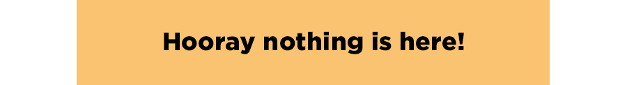
<div className="App" style={{background:randomColor()}}>
Hooray nothing is here!
</div>
);
}
export default App;
It shows you something like this:
Getting Started is Easy
To use Material UI Grids, we can start with wrapping our ‘Hooray nothing is here!' with a Grid, and notice that nothing changes.
You can think of Grids like a ‘replacement’ for a div, but they’re much more special.
Grid Item vs. Grid Container?
import React from 'react';
import './App.css';
import {Grid} from '@material-ui/core';
import randomColor from 'randomcolor';

function App() {
  return (
    <div  className="App">
        <Grid style={{background:randomColor()}}>
          Hooray something is here!
        </Grid>
    </div>
  );
}

export default App;
A Grid can have two types of layouts: containers and items. It’s a pretty easy concept, a container contains grid items, and a grid item is in a grid container. A container has special properties that can be set but we’ll touch on that later. The two properties are not mutually exclusive, so you can have a grid that’s both an item and a container.
function App() {
  return (
    <div  className="App">
      <Grid container>
        <Grid item style={{background:randomColor()}}>
          Hooray something is here!
        </Grid>
      </Grid>
    </div>
  );
}
Grid Items, Columns, and Break Points
This section contains the most important information for understanding Material UI Grids. Feel free to re-read it a few times if it doesn’t make sense at first.
By default, Material UI Grids will try to space your items perfectly evenly, so if you have something simple, like 4 grids items, each item will take up 25% of the window.
But, Material UI Grids work on a 12 column grid-layout, and each grid width is a certain percentage of that. So, if we have a Grid of 6, that width should be about 50%.
So we can have something like this:
function App() {
  return (
    <div  className="App">
      <Grid container>
        <Grid item xs={6} style={{background:randomColor()}}>
          Hooray something is here!
        </Grid>
        <Grid item xs={6} style={{background:randomColor()}}>
          Hooray something is too!
        </Grid>
      </Grid>
    </div>
  );
}
There are a couple of key things to note here like containers and items, but we’ll cover that later. What we’re more interested in is the property that says xs={6}.
Like I stated before, Material UI divides the numbers we give it to 12 columns and spaces our content appropriately. Now, we have a layout that looks something like this:

Material-UI defines how the Grid acts according to specific breakpoints. Below is a table that shows when a specific breakpoint is reached.
| Breakpoint Key |
Window Size |
| xs |
0-599 px |
| sm |
600px – 959px |
| md |
960px – 1279px |
| lg |
1280 – 1919px |
| xl |
1920px+ |
Breakpoints are defined starting from the bottom up, meaning if we have xs defined, but not sm or md, it will apply that breakpoint style of the lowest possible key.
If we were to define an md key, then our xs breakpoint would apply, up until we hit that md window size. Our defined xs key only affects screen widths between 0-959px. At 960+ px, our md key would apply.
That was a lot of information, so let’s see it in practice.
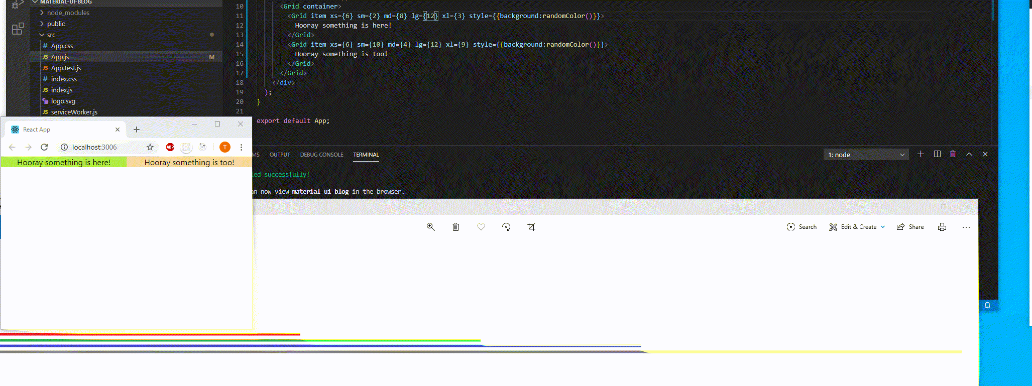
In the gif above, each of the four different lines on the bottom of the screen represent different breakpoints. As you can see, when the window screen crosses across the different boundaries, we apply the properties that were specified to Material UI.
<Grid container>
  <Grid item xs={6} sm={2} md={8} lg={12} xl={3} style={{background:randomColor()}}>
     Hooray something is here!
  </Grid>
  <Grid item xs={6} sm={10} md={4} lg={12} xl={9} style={{background:randomColor()}}>
     Hooray something is too!
  </Grid>
</Grid>
One thing to note is that, if we look at xs={6} for both of our Grid items, it splits the space evenly. When we get to the breakpoint of lg and specify the {12} size, we basically ‘fill’ that 12 column limit and move our content on to a new row.
By placing our breakpoints to equal 12, we say that we want this Grid item to occupy its own row.
This might be enough for the given use case, but with Grid containers, we can go even further.
Container Magic
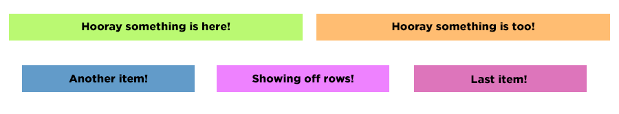
With Grid Containers, we can arrange all of our grid items the way that we want to. The first thing we want to do is add spaces around the grid items so that the content isn't directly touching one another. We can add the prop ‘spacing’ and which takes in a value between 0 and 10.
The space between each grid is the number you chose, times 8pixel. For example, spacing={2} is 16 pixels.
For this example, we’ll refactor it slightly so that the background color only applies to the content inside the grid, and not the actual grid itself, so we can see the spacing.
function App() {
  return (
    <div  className="App">
      <Grid container spacing={3}>
        <Grid item xs={6}>
          <div style={{background:randomColor()}}>Hooray something is here!</div>
        </Grid>
        <Grid item xs={6}>
          <div style={{background:randomColor()}}> Hooray something is too! </div>
        </Grid>
        <Grid item xs={4}>
          <div style={{background:randomColor()}}> Another item! </div>
        </Grid>
        <Grid item xs={4}>
          <div style={{background:randomColor()}}> Showing off rows! </div>
        </Grid>
        <Grid item xs={4}>
          <div style={{background:randomColor()}}> Last item! </div>
        </Grid>
      </Grid>
    </div>
  );
}
And now, we have our grids spaced apart!
We can also add the prop direction to our container to pick if we want the grids to be in row or column form. When the direction is in a column, instead of the default row configuration, each grid gets its own row.
We can still define breakpoints to size our component, however, the breakpoint values will only effect width, so an xs={6} will continue to occupy about 50% of the page.
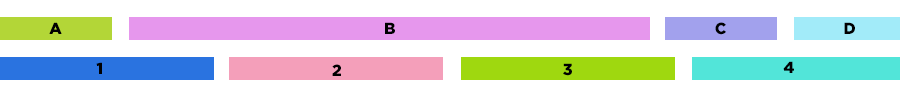
Lazy Layouts (Auto-layout)
There’s been a lot of talk about breakpoints which may be off-putting, however, Grids has an answer with its auto-layout functionality. In a given row, we only need to define at least one actual numeric value of the items in a given breakpoint for the system to figure itself out. We still have to specify that the Grid items are the same breakpoints, but with this, we only have to write one number:
function App() {
  return (
    <div  className="App">
      <Grid container spacing={3}>
        <Grid item xs>
          <div style={{background:randomColor()}}> A</div>
        </Grid>
        <Grid item xs={7}>
          <div style={{background:randomColor()}}> B </div>
        </Grid>
        <Grid item xs>
          <div style={{background:randomColor()}}> C </div>
        </Grid>
        <Grid item xs>
          <div style={{background:randomColor()}}> D </div>
        </Grid>
      </Grid>
      <Grid container spacing={3}>
        <Grid item xs>
          <div style={{background:randomColor()}}> 1</div>
        </Grid>
        <Grid item xs>
          <div style={{background:randomColor()}}> 2 </div>
        </Grid>
        <Grid item xs>
          <div style={{background:randomColor()}}> 3 </div>
        </Grid>
        <Grid item xs>
          <div style={{background:randomColor()}}> 4 </div>
        </Grid>
      </Grid>
    </div>
  );
}
That about does it for Material-UI Grids.
Learn more about DMC's Application Development Expertise and contact us with project inquiries!