Overview
The AutoCompleteBox is a handy WPF (Windows Presentation Foundation) control that can be used by installing the DotNetProjects.WpfToolkit.Input package from Visual Studio's NuGet Package Manager. The AutoCompleteBox is basically a searchable ComboBox that gives the user a fast way to filter a list of dropdown items.
When first working with this control, I found it very difficult to style. There are many properties and multiple controls that make up the AutoCompleteBox. This makes it difficult to know the best approach to get your desired style.
This blog aims to help you navigate through one way the AutoCompleteBox can be styled so that you can use pieces of this style to create your own. While this article is centered around the AutoCompleteBox, you will also need to create styles for a ToggleButton, TextBox, ScrollBar, and ListBoxItem since these controls are elements within the AutoCompleteBox itself.
My Setup
To set up this styling tutorial, I created a new WPF Application project in Visual Studio. I will be working within `MainWindow.xaml` and `MainWindow.xaml.cs` to demonstrate styles and populate the AutoCompleteBox's ItemsSource. I have defined a few SolidColorBrush controls that will be utilized in the styles later.
MainWindow.xaml

Window

    x:Class="AutoCompleteBoxStyling.MainWindow"

    xmlns="http://schemas.microsoft.com/winfx/2006/xaml/presentation"

    xmlns:x="http://schemas.microsoft.com/winfx/2006/xaml"

    xmlns:d="http://schemas.microsoft.com/expression/blend/2008"

    xmlns:mc="http://schemas.openxmlformats.org/markup-compatibility/2006"

    xmlns:local="clr-namespace:AutoCompleteBoxStyling"

    xmlns:controls="clr-namespace:System.Windows.Controls;assembly=DotNetProjects.Input.Toolkit"

    mc:Ignorable="d"

    Title="MainWindow"

    Height="450"

    Width="800">

    <StackPanel>

        <StackPanel.Resources>

<SolidColorBrush x:Key="TextBoxBackground" Color="#FFFFFF" />

            <SolidColorBrush x:Key="TextBoxBorder" Color="#BAC2C9" />

            <SolidColorBrush x:Key="PrimaryTextForeground" Color="#465A6E" />

            <SolidColorBrush

                x:Key="SelectionBackground"

                Opacity="0.2"

                Color="#465A6E" />

            <SolidColorBrush

                x:Key="ScrollForeground"

                Opacity="0.2"

                Color="#001428" />

        </StackPanel.Resources>

        <controls:AutoCompleteBox x:Name="acb" />

    </StackPanel>

</Window>

MainWindow.xaml.cs

using System.Collections.Generic;

using System.Windows;

namespace AutoCompleteBoxStyling

{

    /// <summary>

    /// Interaction logic for MainWindow.xaml

    /// </summary>

    public partial class MainWindow : Window

    {

        public MainWindow()

        {


            InitializeComponent();

            var items = new List<string>()

            {

                "Banana",

                "Apple",

                "Orange",

                "Grape",

                "Pineapple",

                "Blueberry",

                "Strawberry",

                "Raspberry",

                "Peach"

            };

            acb.ItemsSource = items;

        }

    }

}
Default Style
The AutoCompleteBox's default style is the same as a blank TextBox. Once you begin typing into the TextBox, a dropdown will appear containing the AutoCompleteBox's items that start with the entered text.
This default style comes with great functionality out of the box, but you may want to update it to make it more cohesive with the rest of your application.
Custom Styles
The goal for this tutorial will be to style our AutoCompleteBox as shown below.
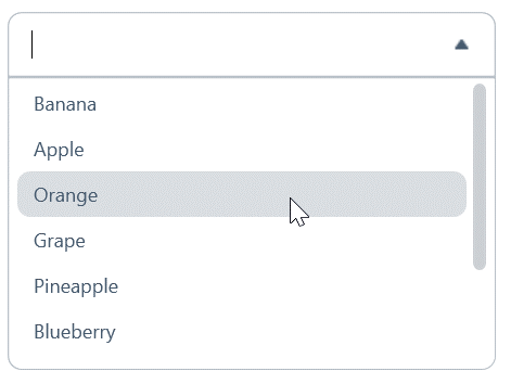
This will require customizing a TextBox, ListBoxItem, ScrollBar and ToggleButton control along with the AutoCompleteBox.
I will be styling using Setters, Triggers, and Templates. Setters are great for setting Property values of the class. Triggers are used to change a property based on another property. For instance, we can use a trigger to change the background of a TextBlock when the property IsMouseOver is True. We can also use a DataTrigger to bind values on a view model or to properties on other controls using RelativeSource.
Templates will be needed if we cannot change the control's style through properties alone. It is typically most straightforward to use Setters and Triggers as much as possible and to only rely on Templates when the other options are not enough. Templates can be tricky to work with since the control may be dependent on certain Template components. If you are unaware of what the default Template is, you may accidentally omit a component needed for the control to work. More information on general styling, including Setters, Triggers, and Templates, can be found here.
ToggleButton Style
The ToggleButton is a control that can represent two or three states. For our AutoCompleteBox, the ToggleButton will represent two states for the dropdown’s open and closed states.
The ToggleButton content will be a caret down icon when the dropdown is closed and a caret up icon when the dropdown is open. The ToggleButton can be styled with Setters as needed, but, to remove the default hover effect on the ToggleButton, the Template property will need to be set. The ToggleButton's default styles can be seen here. The style for the ToggleButton without hover effects can be seen below.
Style x:Key="DropDownToggleButton" TargetType="{x:Type ToggleButton}">

                <Setter Property="Background" Value="Transparent" />

                <Setter Property="BorderThickness" Value="0" />

                <Setter Property="HorizontalAlignment" Value="Right" />

                <Setter Property="HorizontalContentAlignment" Value="Center" />

                <!--  Set the control template to remove any hover effects on the button  -->

                <Setter Property="Template">

                    <Setter.Value>

                        <ControlTemplate TargetType="{x:Type ToggleButton}">

                            <Border Background="{TemplateBinding Background}"

                            BorderThickness="{TemplateBinding BorderThickness}"

                            SnapsToDevicePixels="True">

                                <ContentPresenter HorizontalAlignment="{TemplateBinding HorizontalContentAlignment}"

                                          VerticalAlignment="{TemplateBinding VerticalContentAlignment}"

                                          Focusable="False"

                                          RecognizesAccessKey="True" />

                            </Border>

                        </ControlTemplate>

                    </Setter.Value>

                </Setter>

                <Setter Property="VerticalAlignment" Value="Center" />

            </Style>
TextBox Style
The TextBox control in the AutoCompleteBox is where the user inputs their search filter. The TextBox for our desired AutoCompleteBox has rounded corners and a ToggleButton. The rounded corners and the ToggleButton content will change depending on whether the dropdown is open or closed.
When the dropdown is closed, the corners will be rounded and the ToggleButton will be a caret down icon. When the dropdown is open, only the top corners will be rounded and the ToggleButton will be a caret up icon. The icons will need to be added to your solution and referenced appropriately.
We will need to set a ControlTemplate for our TextBox since the TextBox properties alone cannot give us these effects. We will set Triggers on the TextBox Border and the ToggleButton that will bind to the AutoCompleteBox's IsDropDownOpen property.
The IsDropDownOpen property is True if the AutoCompleteBox is showing the dropdown list below the TextBox and is false otherwise. This will allow us to display the correct corner radius and caret icon based on the dropdown state. The style for the TextBox can be seen below.
Style x:Key="DropDownTextBoxStyle"

           BasedOn="{StaticResource DefaultTextBoxStyle}"

           TargetType="{x:Type TextBox}">

                <Setter Property="Background" Value="{DynamicResource TextBoxBackground}" />

                <Setter Property="BorderBrush" Value="{DynamicResource TextBoxBorder}" />

                <Setter Property="FontSize" Value="{DynamicResource ExtraSmallFontSize}" />

                <Setter Property="Foreground" Value="{DynamicResource PrimaryTextForeground}" />

                <Setter Property="Height" Value="40" />

                <Setter Property="Padding" Value="15,0" />

                <Setter Property="VerticalContentAlignment" Value="Center" />

                <Setter Property="Template">

                    <Setter.Value>

                        <ControlTemplate TargetType="TextBox">

                            <Border x:Name="TextBoxBorder"

                            Padding="{TemplateBinding Padding}"

                            Background="{TemplateBinding Background}"

                            BorderBrush="{TemplateBinding BorderBrush}"

                            BorderThickness="1">

                                <Border.Style>

                                    <!--  Set triggers to change the corner radius of the bottom border when the Dropdown is open  -->

                                    <Style TargetType="Border">

                                        <Style.Triggers>

                                            <DataTrigger Binding="{Binding RelativeSource={RelativeSource FindAncestor, AncestorType={x:Type dotnetControls:AutoCompleteBox}}, Path=IsDropDownOpen}" Value="False">

                                                <Setter Property="CornerRadius" Value="8" />

                                            </DataTrigger>

                                            <DataTrigger Binding="{Binding RelativeSource={RelativeSource FindAncestor, AncestorType={x:Type dotnetControls:AutoCompleteBox}}, Path=IsDropDownOpen}" Value="True">

                                                <Setter Property="CornerRadius" Value="8 8 0 0" />

                                            </DataTrigger>

                                        </Style.Triggers>

                                    </Style>

                                </Border.Style>

                                <Grid>

                                    <ScrollViewer x:Name="PART_ContentHost" />

                                    <ToggleButton IsChecked="{Binding RelativeSource={RelativeSource FindAncestor, AncestorType={x:Type dotnetControls:AutoCompleteBox}}, Path=IsDropDownOpen, Mode=TwoWay}" Style="{StaticResource DropDownToggleButton}">

                                        <ToggleButton.Content>

                                            <Image Width="8"

                                           Margin="10,10"

                                           HorizontalAlignment="Right">

                                                <Image.Style>

                                                    <!--  Set triggers for the caret icon to change depending on if the Dropdown is open or not  -->

                                                    <Style TargetType="Image">

                                                        <Style.Triggers>

                                                            <DataTrigger Binding="{Binding RelativeSource={RelativeSource FindAncestor, AncestorType={x:Type dotnetControls:AutoCompleteBox}}, Path=IsDropDownOpen}" Value="False">

                                                                <Setter Property="Source" Value="/Resources/Icons/sort-caret-down.png" />

                                                            </DataTrigger>

                                                            <DataTrigger Binding="{Binding RelativeSource={RelativeSource FindAncestor, AncestorType={x:Type dotnetControls:AutoCompleteBox}}, Path=IsDropDownOpen}" Value="True">

                                                                <Setter Property="Source" Value="/Resources/Icons/sort-caret-up.png" />

                                                            </DataTrigger>

                                                        </Style.Triggers>

                                                    </Style>

                                                </Image.Style>

                                            </Image>

                                        </ToggleButton.Content>

                                    </ToggleButton>

                                </Grid>

                            </Border>

                        </ControlTemplate>

                    </Setter.Value>

                </Setter>

            </Style>
ListBoxItem Style
The ListBoxItem needs styling so that we can add the appropriate hover effects. When the user mouses over an option or an option is selected, we would like to add a background color to that item. This can be done with the style below.
Style x:Key="ListBoxItemStyle" TargetType="{x:Type ListBoxItem}">

        <Setter Property="Template">

            <Setter.Value>

                <ControlTemplate TargetType="{x:Type ListBoxItem}">

                    <Border Margin="4,0" CornerRadius="8">

                        <TextBlock Padding="10,6" Text="{Binding}" />

                        <Border.Style>

                            <Style TargetType="Border">

                                <Style.Triggers>

                                    <Trigger Property="IsMouseOver" Value="True">

                                        <Setter Property="Background" Value="{StaticResource SelectionBackground}" />

                                    </Trigger>

                                    <DataTrigger Binding="{Binding RelativeSource={RelativeSource FindAncestor, AncestorType={x:Type ListBoxItem}}, Path=IsSelected}" Value="True">

                                        <Setter Property="Background" Value="{StaticResource SelectionBackground}" />

                                    </DataTrigger>

                                </Style.Triggers>

                            </Style>

                        </Border.Style>

                    </Border>

                </ControlTemplate>

            </Setter.Value>

        </Setter>

    </Style>
ScrollBar Style
The styling for the scroll bar is shown below. The ScrollBar is also made up of a Track and Thumb that will need styling as well.
Style x:Key="ScrollBarThumb" TargetType="{x:Type Thumb}">

                <Setter Property="Focusable" Value="False" />

                <Setter Property="IsTabStop" Value="False" />

                <Setter Property="OverridesDefaultStyle" Value="True" />

                <Setter Property="SnapsToDevicePixels" Value="True" />

                <Setter Property="Template">

                    <Setter.Value>

                        <ControlTemplate TargetType="{x:Type Thumb}">

                            <Border

                                Background="{TemplateBinding Foreground}"

                                BorderBrush="{TemplateBinding Foreground}"

                                BorderThickness="1"

                                CornerRadius="4" />

                        </ControlTemplate>

                    </Setter.Value>

                </Setter>

            </Style>

            <ControlTemplate x:Key="VerticalScrollBarWithoutButtons" TargetType="{x:Type ScrollBar}">

                <Grid>

                    <Grid.RowDefinitions>

                        <!--Row heights can be adjusted as needed-->

                        <RowDefinition MaxHeight="4" />

                        <RowDefinition Height="*" />

                        <RowDefinition MaxHeight="4" />

                    </Grid.RowDefinitions>

                    <Border

                        Grid.RowSpan="3"

                        Background="{TemplateBinding Background}"

                        CornerRadius="4" />

                    <Border

                        Grid.Row="1"

                        Background="Transparent"

                        BorderThickness="0"

                        CornerRadius="4">

                        <Track

                            x:Name="PART_Track"

                            Grid.Row="1"

                            IsDirectionReversed="true">

                            <Track.Thumb>

                                <Thumb

                                    Margin="0,0,0,0"

                                    Background="{DynamicResource ScrollForeground}"

                                    Style="{StaticResource ScrollBarThumb}" />

                            </Track.Thumb>

                        </Track>

                    </Border>

                </Grid>

            </ControlTemplate>

            <Style x:Key="DropDownScrollBar" TargetType="{x:Type ScrollBar}">

                <Setter Property="Background" Value="Transparent" />

                <Setter Property="Foreground" Value="{DynamicResource ScrollForeground}" />

                <Setter Property="OverridesDefaultStyle" Value="True" />

                <Setter Property="SnapsToDevicePixels" Value="True" />

                <Style.Triggers>

                    <Trigger Property="Orientation" Value="Vertical">

                        <Setter Property="Height" Value="Auto" />

                        <Setter Property="Margin" Value="0,-2,4,-2" />

                        <Setter Property="Template" Value="{StaticResource VerticalScrollBarWithoutButtons}" />

                        <Setter Property="Width" Value="8" />

                    </Trigger>

                </Style.Triggers>

            </Style>
AutoCompleteBox Style
Lastly, the AutoCompleteBox itself needs styling. A couple of properties that are specific to the AutoCompleteBox are MinimumPrefixLength and FilterMode. Setting MinimumPrefixLength to 0 allows the user to see the dropdown with all available choices when they click into the TextBox. The FilterMode determines how the dropdown list will be filtered based on the user's text input.
To give the dropdown rounded corners, we will need to style the ControlTemplate of the AutoCompleteBox as well. The ControlTemplate should consist of a TextBox and a Popup. Within the Popup, there is a ListBox that is wrapped by a Border so that we can set the CornerRadius of the Border control.
The VisualStateManager.VisualStateGroups will also need to be utilized. If the VisualStateGroup "PopupStates" is not defined, it will create a bug that causes the AutoCompleteBox's SelectedItem to be null when the dropdown closes. The custom style can be seen below.
Style TargetType="dotnetControls:AutoCompleteBox">

        <Setter Property="Background" Value="{StaticResource TextBoxBackground}" />

        <Setter Property="BorderBrush" Value="{StaticResource TextBoxBorder}" />

        <Setter Property="BorderThickness" Value="1" />

        <Setter Property="FilterMode" Value="Contains" />

        <Setter Property="Foreground" Value="{StaticResource PrimaryTextForeground}" />

        <Setter Property="IsTabStop" Value="False" />

        <Setter Property="ItemContainerStyle" Value="{StaticResource ListBoxItemStyle}" />

        <Setter Property="MaxDropDownHeight" Value="180" />

        <Setter Property="MinimumPrefixLength" Value="0" />

        <Setter Property="Padding" Value="6,0" />

        <Setter Property="Template">

            <Setter.Value>

                <ControlTemplate TargetType="dotnetControls:AutoCompleteBox">

                    <Grid Opacity="{TemplateBinding Opacity}">

                        <TextBox x:Name="Text"

                                 Margin="0"

                                 Padding="{TemplateBinding Padding}"

                                 Background="{TemplateBinding Background}"

                                 BorderBrush="{TemplateBinding BorderBrush}"

                                 BorderThickness="{TemplateBinding BorderThickness}"

                                 Foreground="{TemplateBinding Foreground}"

                                 IsTabStop="True"

                                 Style="{TemplateBinding TextBoxStyle}" />

                        <Popup x:Name="Popup"

                               AllowsTransparency="True"

                               Placement="Bottom"

                               PlacementTarget="{Binding ElementName=Text}">

                            <Border x:Name="PopupBorder"

                                    Padding="0"

                                    HorizontalAlignment="Stretch"

                                    Background="{TemplateBinding Background}"

                                    BorderBrush="{TemplateBinding BorderBrush}"

                                    BorderThickness="{TemplateBinding BorderThickness}"

                                    CornerRadius="0 0 8 8"

                                    Opacity="1.0">

                                <ListBox x:Name="Selector"

                                         Background="{TemplateBinding Background}"

                                         BorderThickness="0"

                                         Foreground="{TemplateBinding Foreground}"

                                         ItemContainerStyle="{TemplateBinding ItemContainerStyle}"

                                         ItemTemplate="{TemplateBinding ItemTemplate}"

                                         ScrollViewer.HorizontalScrollBarVisibility="Auto"

                                         ScrollViewer.VerticalScrollBarVisibility="Auto">

                                    <ListBox.Resources>

                                        <Style TargetType="Border">

                                            <Setter Property="CornerRadius" Value="0 0 8 8" />

                                        </Style>

                                    </ListBox.Resources>

                                </ListBox>

                            </Border>

                        </Popup>

                        <!--  Define empty visual state groups to prevent issue with selected item being set to null when drop down closes  -->

                        <VisualStateManager.VisualStateGroups>

                            <VisualStateGroup x:Name="PopupStates">

                                <VisualState x:Name="PopupOpened" />

                                <VisualState x:Name="PopupClosed" />

                            </VisualStateGroup>

                        </VisualStateManager.VisualStateGroups>

                    </Grid>

                </ControlTemplate>

            </Setter.Value>

        </Setter>

        <Setter Property="TextBoxStyle" Value="{StaticResource DropDownTextBoxStyle}" />

        <Setter Property="Width" Value="300" />

        <Style.Resources>

            <Style BasedOn="{StaticResource DropDownScrollBar}" TargetType="ScrollBar" />

        </Style.Resources>

    </Style>
Summary
Once all the styles are added to the Resources of the main control in `MainWindow.xaml,` you should have an AutoCompleteBox that looks like this.
Learn about DMC's Application Development expertise and contact us for your next project.