As a UX/UI Designer, there are so many tips and tricks I wish I knew from the start. Several quick little “quality of life things” that I know now would have sped up my workflow and improved my designs. These things often come from experience and having good mentors around you.
If you need some tips and tricks ASAP, then you came to the right blog. Here are five advanced design hacks for beginners written by an intermediate.
Tip #1
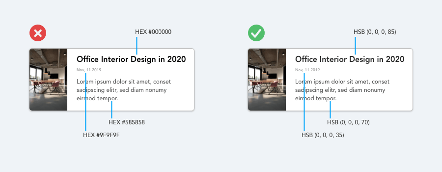
Don’t waste time creating multiple shades of black. Use an opacity slider instead.
Whether creating a poster, user interface, or a simple presentation, using different shades of black for text will be necessary. Instead of consistently using your color picker to select new colors, why not try different shades of black over a white background.
Using pure shades of black (#000000) causes eye strain for readers over long periods of time. It is best to use a slightly “off-black” color as your absolute black. Instead of color picking three or more hex color values, use black with different opacity as a solution.
In the example below, I used my “off-black” as my primary color and decreased its opacity depending to where it will be applied (i.e., primary content, secondary content, tertiary content)
Tip #2
Use color, font weight, and spacing to create hierarchy within your design.
Color and Weight
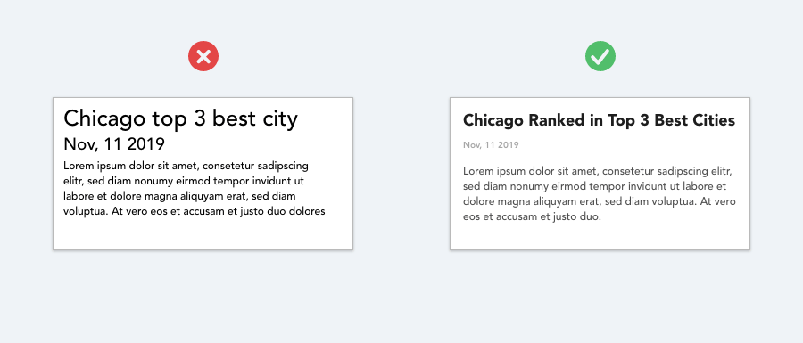
A common mistake when styling text for a UI or any piece of design is relying too much on font size to control your hierarchy.
Instead of leaving all the heavy lifting to font size alone, a good trick is to use color or font weight to do the same job. If this bit of text is so important, it's better to make it bolder, not bigger. This technique increases the text's visual prominence and contrast without drastically increasing its overall footprint on the page.
Two font weights are usually enough for UI work: A normal (Regular) font-weight for most body copy type text, and a heavier (Bold) font-weight for the text you want to emphasize (headlines).
You may want to stay away from any font labeled “Light” or “Thin.” I’ve made this mistake several times and had to correct it. If you want to de-emphasize some text use a lighter color or smaller font size instead of a thinner weight.
As for color, try and to stick to two or three colors in your UI design:
- A dark color (i.e., for primary content, like the headline of an article)
- A grey for secondary content (i.e., body paragraph copy or descriptive text below the headline)
- A lighter grey for a tertiary copy (i.e., the date an article was published on or a location tag).
These two tips will help create a more clearly defined hierarchy within your designs without falling into the common pitfalls when trying to do so.
Now that you have your content styled correctly, it’s time to space everything out and solidify the user experience.
Spacing
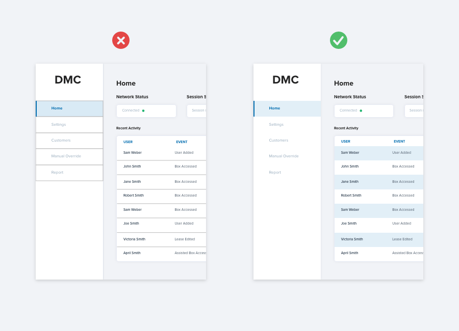
There are many actions you can take to group UI elements. Using a generous space between objects is a fast, simple, and easy to implement solution. One of the fundamentals rules of UX Design, the Law of Proximity, states that objects that are closer together spatially tend to be grouped together.
In this example, we can see that by moving and grouping elements together with white space, we can more easily create groups and eliminate the need for boxes or rule elements. This approach creates a cleaner design and one that is easier for your developers to implement.
Tip #3
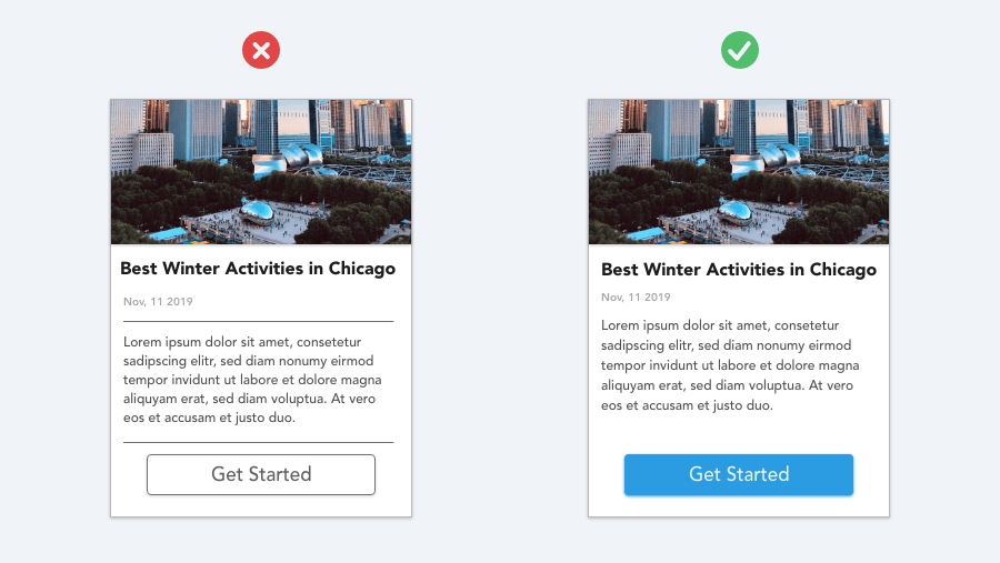
Use color to separate lists, dropdowns, and table components instead of rule elements.
Creating rows and columns in any setting, for any component, can be a tedious and boring task at times. From a user’s perspective, however, a well-designed list, table, or drop menu can make an experience easier to use and more rewarding.
Common issues with row-based components include difficulty reading, losing your place on a particular line, or getting information confused and mismatched.
Instead of using lines and strokes to divide rows, try a colored background instead. This approach makes each line unique compared to the ones on top and below it. Making this cosmetic decision gets two birds with one stone as it eliminates users' pain points and makes the component more visually pleasing.
Tip #4
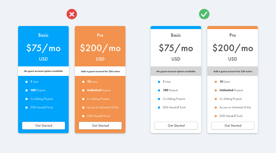
Avoid huge blocks of color. Instead, use small pops of color to spice up and accent a bland design.
People often turn to photography, iconography, or a complex digital illustration to bring visual flair to their designs (if you’ve explored Dribble recently, you’ll know what I’m talking about). Instead, a simple trick many other designers and I use is to add a colorful accent to part of your interface that would otherwise feel a bit bland. Rather than adding huge blocks of color and going visually overboard, small accents of color can go a long way and exemplify restraint.
Have a hard time picking colors? Try using coolors.co. The color picker is flexible and easy to use. Their UI makes it easy to pick one color and build the rest of the palette around it, which is a feature I really like.
Tip #5
Not every button needs a background color and a rounded corner.
What would a user interface be without buttons? There are many different styles you can add to your button. When I first started designing user interfaces, I approached buttons with a very semantic-heavy thought process.
For example, if I needed to design a "start process" button, I would make it green. If I needed a "stop" button, I would make it red.
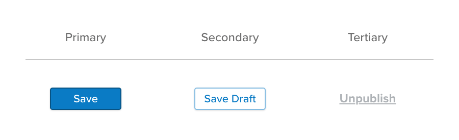
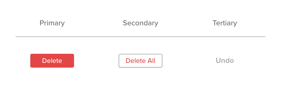
Avoid this trope by dividing buttons styles into a more critical factor: hierarchy of importance (i.e., primary, secondary, and tertiary actions).
Primary actions should be distinct. Solid, high contrast background colors. Secondary actions should be clearly defined, but not the most prominent. Outline styles or lower contrast background colors are great options. Tertiary actions should be discoverable but unobtrusive. Styling these actions as links is good approach.
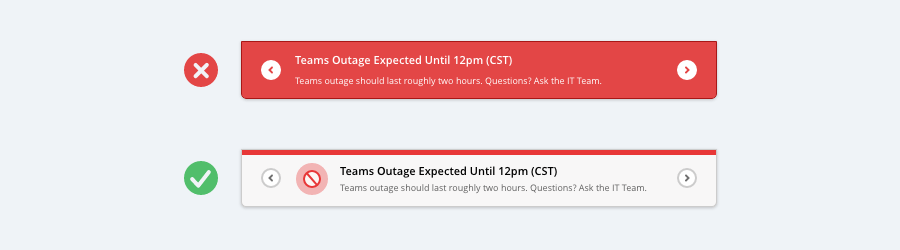
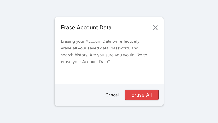
Destructive does not always = Red
If a destructive action isn’t the primary action on the page, it might be better to give to make it a more secondary or tertiary action look. A destructive button that is the primary action on the page or dialog is worthy of the big, red, bold button. See the examples below.
I hope these “5 Advanced UI Design Hacks for Beginners” were helpful and get you thinking about new ways to approach the decisions you have to make every day as a UX/UI designer. I’m sure you would have discovered these on your own in time, but I’m glad you decided to do your research and streamline the process.
Learn more about DMC’s UX/UI Design Services.