Material UI is a great tool for speeding up the development process of your react app. The library offers out-of-the-box React UI components with built-in properties that greatly simplify the implementation of the styling and interaction requirements of your product.
Out-of-the-box UI rarely matches the predetermined design of an application alone, however. In these situations, we are required to open these components and tinker with their CSS styles directly.
Material UI offers extensive documentation for component styling and customization, but the actual process of reworking these styles can be confusing and frustrating. In this blog post, I hope to simplify this process by covering 3 common pitfalls when overriding material UI styles.
This post will exemplify these pitfalls by overriding styles on a MUI TextField component. The implementation of these examples can be found in this Code Sandbox. The source code we will start off with is a single TextField component rendered to the page, with style overrides controlled with MUI's built-in createTheme() function:
1 2 3 4 5 6 7 8 9 10 11 12 13 14 15 16 17 18 19 20 | const theme = createTheme(
}
}
}
});
export default function App()
">
<box>
<textfield inputprops="
}
/>
</textfield></box>
</themeprovider>
);
}
|
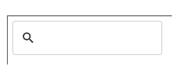
With no overrides in place to begin, the rendered page looks like this:
There are multiple approaches to specifying style overrides within your project, and you may require something different than what is provided in this demo. For more information on the different approaches for locating style overrides, check out the MUI documentation.
Part 1: MaterialUI Slot Selectors
Style overrides are most commonly located in a "theme" object. This object designates custom styles to components and the "slots" that compose a given component. Each slot maps to a single HTML element rendered as part of the larger component.
To add or override a style, we specify both the component and slot that we are targeting. The styles we specify are applied in a CSS class specific to that element. In the example below, we target the input element within an MUI TextField, which is accessed by the MUI component MuiInputBase and slot root:
1 2 3 4 5 6 7 8 9 10 11 | const theme = createTheme(
}
}
}
});
|
Pitfall: Choosing the Wrong Slot
When we specify styles for a component, they may appear in the rendered CSS but not induce a visible change on the page. In this case, it is possible that the slot you have specified is not the correct one to target. A good practice to prevent this issue is to determine where these styles you want to override are being initially applied, and ensure you specify those slots in your theme.
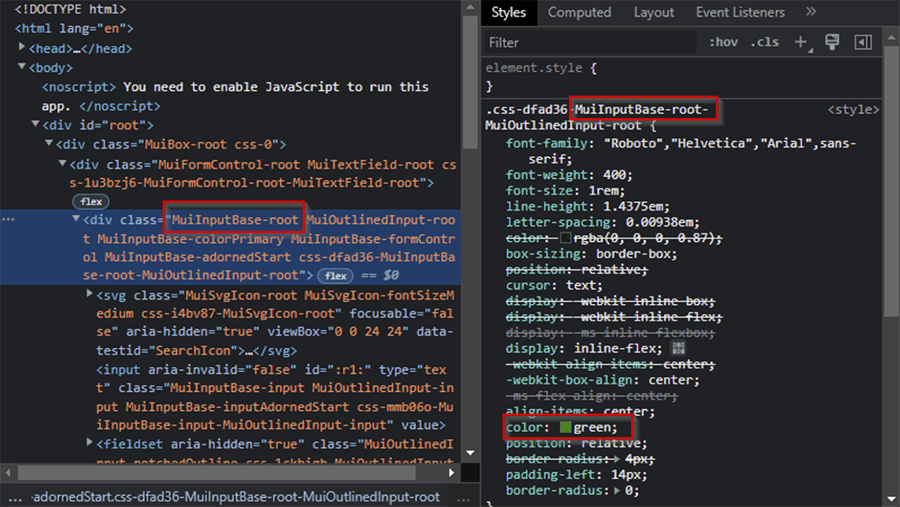
For example, say that I am trying to both increase the width of the TextField border and remove the preset borderRadius. If I apply both updates to the MuiInputBase-root slot, I get the following result:
1 2 3 4 5 6 7 8 9 10 11 12 | const theme = createTheme(
}
}
}
});
|

As you can see, the border has been removed but the width of the box stays the same. If I investigate the styling specified for each slot, I see that there is a default value of borderRadius specified for MuiOutlinedInput-root, but the default borderWidth set on MuiOutlinedInput-notchedOutline is still being applied:
If I move this override to the correct slot, we can see the desired output:
1 2 3 4 5 6 7 8 9 10 11 12 13 14 | const theme = createTheme(
,
notchedOutline:
}
}
}
});
|

Part 2: Correct MUI Class Reference Syntax
Beyond the theme specification exemplified above, MUI theme overrides allow for string keys specifying selectors for higher levels of control over the styles applied.
There are many features of this string notation, but two features are used most frequently:
-
Specifying the component-slot names of a descendant MUI component (akin to CSS descendant combinators)
-
Specifying a state selector which applies styles to the component only if it is in a certain state (akin to CSS pseudo-classes)
An example of both can be seen below:
1 2 3 4 5 6 7 8 9 10 11 12 13 14 15 16 17 18 19 20 21 | const theme = createTheme(
,
"&.Mui-focused":
},
notchedOutline:
}
}
}
})
|

Here, we have added an adornment icon to the TextField which has a default color of black ("rgb(0,0,0)"), but we can specify a selector for this MUI component and update its color to a dark gray ("rgb(220,240,250)"). Additionally, we can set the background color of the field, whenever the field is in focus, by specifying a background color in the state selector ".Mui-focused".
Pitfall: String selector syntax
These string-notation selectors are fantastic for adding a higher level of specificity to your overrides, but they also fall outside of the typing for MUI themes - every key with this notation is just a string. This means that applying styles to incorrectly formatted selectors is an error which will fail silently. With the large feature set of these string selectors, referring to the MUI documentation on formatting is best for more complex cases. For simpler and more common cases like the one above, here is a quick tip that may save you some time:
This small difference is due to how these strings are parsed into plain CSS selectors. Descendant components are implemented with descendant CSS combinators as mentioned above, which require a space. State selectors are simply appended to the existing component class name, so the space is not included. Failing to follow this format for either type of selector results in styles not being applied. Below, we can see that neither the background highlight nor the color modification of the adornment icon is applied when the format is incorrect.
1 2 3 4 5 6 7 8 9 10 11 12 13 14 15 16 17 18 19 20 21 | const theme = createTheme(
,
"&.Mui-focused":
},
notchedOutline:
}
}
}
});
|

Part 3: Selector Specificity is Correct
The nested selector structure shown in the last two examples follows the same rule as applying classes to HTML elements: if two classes are applied to an element and one class has a more specific selector than the other, then the more specific class's styles will be displayed with higher priority than the other.
In MUI theme overrides, specificity is determined by matching slot selectors and state selectors, as well as any base CSS selector.
Pitfall: Override's selector is still not a higher specificity than the out-of-the-box styling
There are already many selectors in the default styles of a MUI component, which are very specific to certain elements within it. If your style override does not show up and the default style is still applied, check the specificity of the style and try to match it with your overriding selector.
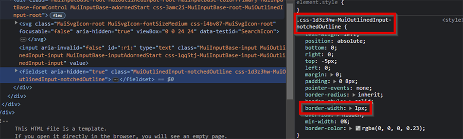
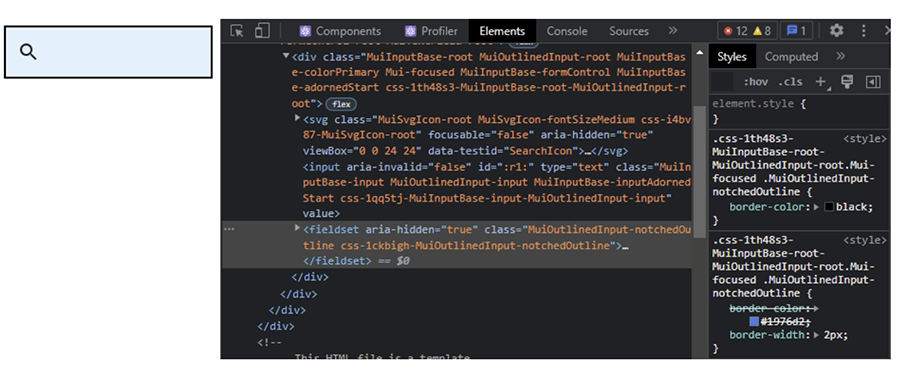
I'll demonstrate this by extending the example from the last two sections. If you noticed in the image from the last section, our custom black border is not present when the text box is selected. The border becomes thinner, and the color changes to a darker blue.
If we dig around the DOM a bit when the TextField component is in focus, we can see a default TextField style that is making this change with the help of the higher specificity of the ".Mui-focused" state selector:
If we want to override the border color of the text field when it is in focus, we need to match the level specificity from the selector of the default style:
1 2 3 4 5 6 7 8 9 10 11 12 13 14 15 16 17 18 19 20 21 22 23 24 | const theme = createTheme(
,
"&.Mui-focused":
}
},
notchedOutline:
}
}
}
});
|
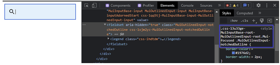
Now, if we look at the DOM and the resultant page, we see that the more specific default style has been successfully overridden:
Another important consideration here is that the selectors must be nested in the right order to be successfully applied; if the .MUI-focused state selector is nested in MuiOutlinedInput-notchedOutline class selector, then the style would not apply.
Conclusion
MUI's default styles and style overrides provide a very high level of configurability to web developers, but opening their out-of-the-box solutions can be tricky. The pitfalls exemplified are not the only possible issues, but, from my experience, keeping these common problems in mind will reduce the time needed for debugging your styles a considerable amount.
Learn more about DMC's Web Application Development services and contact us for your next project.