History
Android Inc. was founded in Palo Alto, California in October 2003 by Andy Rubin, Rich Miner, Nick Sears, and Chris White. Soon after its creation, it was acquired by Google in 2005, and first released to the public in 2008. Android is a mobile operating system for smartphones, tablets, and other connected devices. It is based on a modified version of the Linux and other open source software. The platform is free to download, distribute, and modify.
There are thousands of different phones and tablets from companies such as Samsung, Huawei, One Plus, and LG that use some version of Android as their operating system. Roughly 3 billion people around the world use android. It is, by far the most used mobile device software.
Android 10 is the tenth major iteration of the software and also marks the move away from the unique naming convention Android previously used. Along with the name change comes a major shift in the logo and identity of Android. This is bound to turn some heads and upset some hardcore fans. Let's take a look at the new identity created by Brooklyn born design studio, Huge.
New Identity Intro Video
Video credit to: Android
About the Identity
In a recent blog post, Sameer Samat, VP of Product Management at Android, was quoted saying, "This year, we're introducing a more modern, accessible look. The design of the logo draws inspiration from the most recognizable non-human member of the community, the Android robot. The robot belongs to everyone in the community and has been a symbol of the fun and curiosity at the heart of Android. Now, it has a special place in our logo."
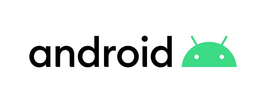
Logo on White
Image credit to: Huge Inc.
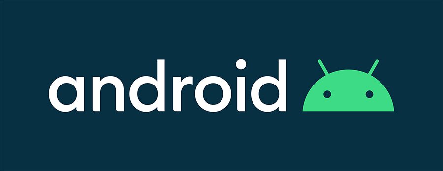
Logo on Dark
Image credit to: Huge Inc.
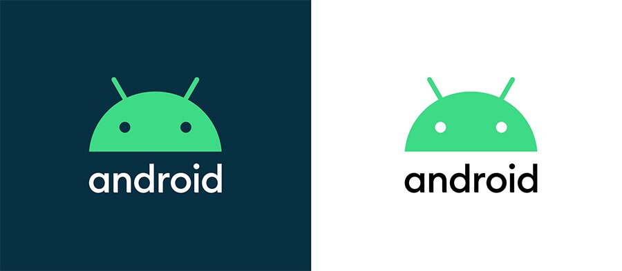
Alternate Logo Lockups
Image credit to: Huge Inc.
The full-bodied robot has become so well-known and symbolic of Android that it is hard to see them ever fully moving away from it. However, the logo did have its flaws. The color, the size, and wordmark all had their own quirks, which made the identity feel dated and less mature than this new refreshed version. The new robot head works amazingly well as an icon. We’re so familiar with the full-bodied version that reducing it down to just the head makes perfect sense. Users still understand the context, the logo is more compact, reduces to a smaller size more easily, and is far more charming. The facial expressions of the robot itself are more playful and better executed than previous robot expressions.
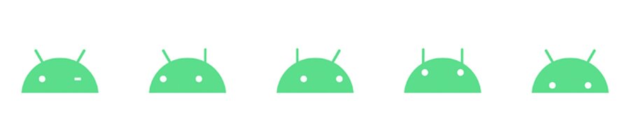
Icon Expressions
Image credit to: Huge Inc.
The old wordmark was my least favorite part of the entire Android brand. The combination of all upper-case letters and the wide-open “D’s” was painful for designers all around. The new logo font is much better. A basic geometric San Serif set in either black or white, it is interesting and fits the aesthetic of the brand well.
Lastly, the new green is a considerable improvement, with a more vibrant hue that is unique and energizing. Once again, Sameer Samat, “We also changed the logo (wordmark to be more specific) from green to black. It’s a small change, but we found the green was hard to read, especially for people with visual impairments.”
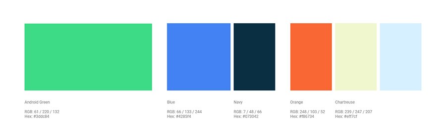
Color Scheme
Image credit to: Huge Inc.
The new logo may upset some Android fans as it makes drastic changes to the robot and the wordmark. I think it is undeniable that this new logo is so much better and pleasing for a designer.
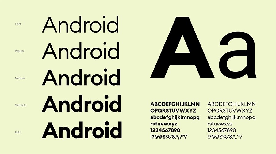
Typography
Image credit to: Huge Inc.
I like the new typeface as it reminds me of other popular fonts such as Helvetica, Gotham, and Proxima Nova.
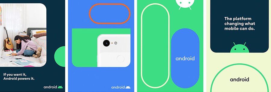
Digital Advertising Collateral
Image credit to: Huge Inc.
Print and digital collateral looks fresh and bright. Huge went with these pill, button-like shapes in both stroked and filled styles. While fairly basic, these match the full visual language of Android and the UI associated with the operating system itself.
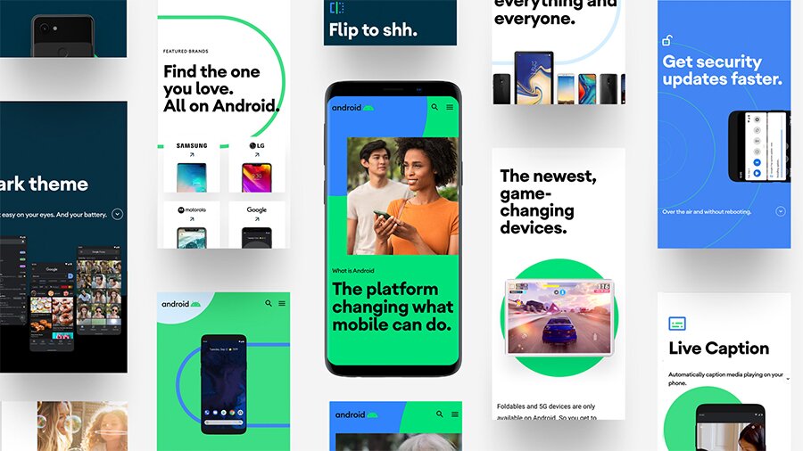
UI Examples
Image credit to: Huge Inc.
Final Thoughts
Overall, I find the update lively, exciting, and maturation of the Android brand. The old identity fit the first few iterations of Android perfectly. In the early days, not only was Android new, the technology, smartphone, and connected device landscape was nowhere near as advanced as it is today. The logo always gave me the impression Android was for developers, programmers, and the tech-savvy. Digital collateral from that time feels almost nostalgic now.
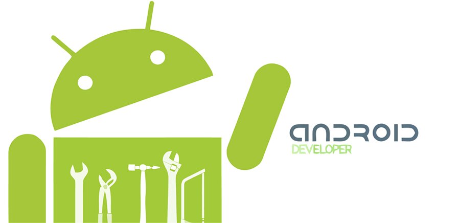
Old Android Developer Artwork
Image credit to: Android Guys
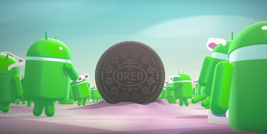
Android Oreo Artwork
Image credit to: GSM Arena
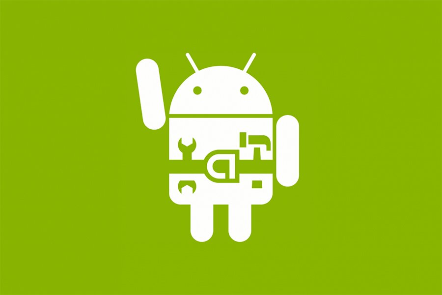
Old Andoird Developer Logo
Image credit to: XDA Developers
Old Android Robot Costumes
Image credit to: The New York Times
Android had got to a point where it outgrew the old branding. Now that both the technology and industry is well established, the branding can focus less on the developer community and more on the consumers themselves. This new logo is a logical step forward for a company that keeps innovating year after year. Huge did a fabulous job with this redesign and has set up Android for even more future success.
Learn more about DMC’s UX/UI Design Services Here.