Overview
When I was first getting exposed to QML as a language for describing user interfaces, almost everything was easy to grasp except the concept of layouts. Their behavior never seemed natural, and I spent a lot of time fighting with them before I was finally able to identify the things that didn’t do what I wanted them to do.
This blog aims to give you the head start I didn’t have by walking you through a series of simple examples that illustrate most of the principles.
A Brief Introduction to Layouts
In short, layouts are QML elements that control how their children (the elements that they contain) are positioned and resized. A layout has no visible characteristics itself. There are a few types of layouts:
RowLayout: positions its children in a single row, either left to right (default) or right to leftColumnLayout: positions its children in a single column, either top to bottom (default) or bottom to topGridLayout: positions children in successive cells of a grid
- Cells in the grid are rearranged when the
GridLayout is resized.
RowLayout and ColumnLayout are special cases of a GridLayout with only one row or column.
The purpose of this walkthrough is to familiarize you with the behaviors of layouts (particularly behaviors that are unintuitive), not to describe all of their features. As such, we will largely focus on the ColumnLayout.
A Side Note on the StackLayout
There is one more QML Layout type called StackLayout. This is most closely related to the concept of “tabs” or “pages,” where different sets of controls can be grouped together and displayed in the same area, and only one group is visible at a time. The StackLayout behaves much like the others, but isn’t primarily for positioning and resizing its content. Since the positioning and resizing behaviors are the interesting ones, we’ll focus on those here, and you will be more than capable of figuring out the StackLayout on your own.
Walkthrough
Let’s step through a series of tests to understand the behavior of layouts.
Step 0: Start a New QtQuick Project in QtCreator
I am using Qt Creator 8.0.2 on Windows, but any recent version on any platform will do. Simply create a new project from the QtQuick application template. I will be using Qt 6.2.1, but Qt5 should be nearly the same.
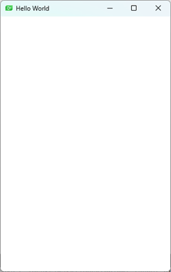
When your template application is generated, you’ll have a file main.qml file that looks like the code on the left. When you build and run the project, you’ll see an empty window like the one on the right. The only change I made to the template QML file is the width of the Window.
import QtQuick


   Window {

       width: 320

       height: 480

       visible: true

       title: qsTr("Hello World")

} |
 |
As a side note, you do not need to build the application to see how the window will behave. You can use the “QML utility” to visualize and interact with the currently-active QML file. This utility can be launched from the Tools menu:
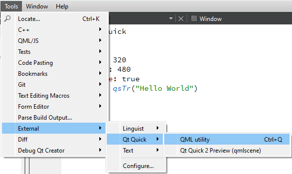
For convenience, I have that utility mapped to Ctrl-Q, which is not the default. By default, Ctrl-Q exits Qt Creator. In a default setup, don’t just hit Ctrl-Q and expect to see your QML object.
Step 1: Add a Rectangle
Let’s put something in that window, maybe just a colored rectangle to start with. In my example code, I'll highlight changes from the previous example in blue:
import QtQuick


   Window {

       width: 320

       height: 480

       visible: true

       title: qsTr("Hello World")


       Rectangle {

           color: "lightBlue"

       }

} |
 |
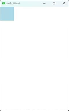
We’ve already hit a snag. Where’s my rectangle?!
It’s there... but Qt has no way of knowing how big a rectangle you want, so, naturally, it chose 0x0 pixels. The rectangle is there, but it has no height or width. It is conceptual... the essence of a rectangle, wafting in the breeze, elusive.
Lesson 1: The implicit height and width of a QML Rectangle object is zero.
Step 2: Make it a Much Better Rectangle
We’ll specify the height and width of the rectangle so we can actually see it. Now we have:
import QtQuick


   Window {

       width: 320

       height: 480

       visible: true

       title: qsTr("Hello World")


       Rectangle {

           color: "lightBlue"

           height: 64

           width: 64

       }

} |
 |
Step 3: More Rectangles. MORE.
Next, add another two rectangles and vary the sizes and colors a little.
import QtQuick


   Window {

       width: 320

       height: 480

       visible: true

       title: qsTr("Hello World")


       Rectangle {

           color: "pink"

           height: 256

           width: 256

       }


       Rectangle {

           color: "lightGreen"

           height: 128

           width: 128

       }


       Rectangle {

           color: "lightBlue"

           height: 64

           width: 64

       }

} |
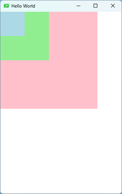 |
This isn’t necessarily what we wanted. In the absence of any specific information about where to put those rectangles, the only reasonable thing to do is just layer them on top of each other in the upper left corner, pink on the bottom, then light green, then light blue on top. If we hadn’t made them different sizes in exactly that order, we wouldn’t have even known, and the smaller rectangles would’ve been hidden under the larger one! We might have gotten incredibly frustrated and hurled our laptop into a fire! Boy, would IT have been mad in this extremely hypothetical example!
Lesson 2: Unless you tell Qt where to put stuff, it won’t know, and it has no problem letting things overlap.
Step 4: Add a Column Layout
As stated above, a layout object’s job is to handle the positioning and sizing of its children. So, let’s put our three rectangles into a column layout and change nothing else. Note that, in order to bring in the layout objects, we need to import the QtQuick.Layouts module at the top:
import QtQuick

   import QtQuick.Layouts


   Window {

       width: 320

       height: 480

       visible: true

       title: qsTr("Hello World")


       ColumnLayout {

           Rectangle {

               color: "pink"

               height: 256

               width: 256

           }


           Rectangle {

               color: "lightGreen"

               height: 128

               width: 128

           }


           Rectangle {

               color: "lightBlue"

               height: 64

               width: 64

           }

       }

} |
 |
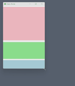
Now we’re cookin’! The ColumnLayout object takes its children and arranges them in a column, in the order that they were declared. Try resizing the window, though. You’ll notice that the window resizes, but the rectangles don’t. They stay the same size, and more blank space fills the areas below and to the right of the rectangles.
Step 5: Filling All Available Space
If we want the rectangles to keep our specified height but always resize to be the width of the window, we can set the Layout.fillWidth property to true in our rectangles. This is the rectangle telling its parent layout, “set my width so that I’m always as wide as possible.”
import QtQuick

   import QtQuick.Layouts


   Window {

       width: 320

       height: 480

       visible: true

       title: qsTr("Hello World")


       ColumnLayout {

           Rectangle {

               color: "pink"

               height: 256

               Layout.fillWidth: true

           }


           Rectangle {

               color: "lightGreen"

               height: 128

               Layout.fillWidth: true

           }


           Rectangle {

               color: "lightBlue"

               height: 64

               Layout.fillWidth: true

           }

       }

} |
 |
WHAT. WHY?
Instead of specifying the width of the rectangles, we told it to make them as wide as possible, and now they’re gone! You might throw several more PCs into a fire before realizing that this is because the ColumnLayout did in fact make them as wide as it could, but the layout can only make its children as wide as it itself is: and, by default, a layout is... 0 pixels wide.
Lesson 3: Layouts, like rectangles, have zero implicit width/height.
Step 6: Make the Layout Wider Than 0 Pixels
We want that layout to be pinned to the width of the window, so let’s anchor the layout to its parent’s boundaries (i.e., make the ColumnLayout fill the Window left-to-right and top-to-bottom) by setting the layout’s anchors.fill property to parent (which is the Window object):
import QtQuick

   import QtQuick.Layouts


   Window {

       width: 320

       height: 480

       visible: true

       title: qsTr("Hello World")


       ColumnLayout {

           anchors.fill: parent


           Rectangle {

               color: "pink"

               height: 256

               Layout.fillWidth: true

           }


           Rectangle {

               color: "lightGreen"

               height: 128

               Layout.fillWidth: true

           }


           Rectangle {

               color: "lightBlue"

               height: 64

               Layout.fillWidth: true

           }

       }

} |
 |
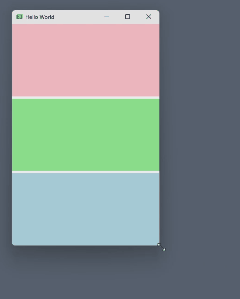
That’s better! Now, the user can resize the window to be as wide or as narrow as needed, and the rectangles will always reach from the far left to the far right. If you stretch the window vertically, you’ll see that the rectangles always stay their specified height and they just get spaced farther apart as the window gets taller. Let’s see if we can fill their heights also!
Step 7: Use the Layout to Fill Height
Now, let’s replace the height property of each rectangle with Layout.fillHeight so the layout will know to resize all of them in both width and height:
import QtQuick

   import QtQuick.Layouts


   Window {

       width: 320

       height: 480

       visible: true

       title: qsTr("Hello World")


       ColumnLayout {

           anchors.fill: parent


           Rectangle {

               color: "pink"

               Layout.fillHeight: true

               Layout.fillWidth: true

           }


           Rectangle {

               color: "lightGreen"

               Layout.fillHeight: true

               Layout.fillWidth: true

           }


           Rectangle {

               color: "lightBlue"

               Layout.fillHeight: true

               Layout.fillWidth: true

           }

       }

} |
 |
Well... now, if we resize the window, the rectangles do always fill both width and height, so that's great! But, now we’ve lost the ratio of heights that made these rectangles so special to begin with! How do we get that back so they fill left & right but maintain a specified ratio vertically?
Step 8: Preferred, Minimum, and Maximum Sizes
There’s a nuance here that is easy to overlook and definitely confused me. When Layout.fillWidth or Layout.fillHeight is true, how does the layout decide what proportion of that dimension is allocated to each element? By default, it makes sense to divide it up evenly, which is what happened. But what happens if there are other constraints, like when we specified width or height? Well, first, consider that width and height are properties of the Rectangle object, whereas Layout.fillHeight talks to the Rectangle’s parent layout. You should not use explicit position or size properties (like x, y, width, or height) in objects managed by a layout. The layout should be free to manage positions and sizes for you.
Lesson 4: If an object is a child of a Layout, don't set explicit size properties of the child. Only use the Layout.* properties to delegate those duties to the Layout.
We can, however, give the layout more information so it can make better decisions. Each element that sets Layout.fillWidth or Layout.fillHeight to true can also set:
Layout.minimumWidth and Layout.minimumHeightLayout.maximumWidth and Layout.maximumHeightLayout.preferredWidth and Layout.preferredHeight
The minimum and maximum properties are self-explanatory, but what does “preferred” mean in the context of elements that the layout wants to stretch to fit all available space? As it turns out, it specifies the proportions! Let’s put our original heights back in there as preferred heights:
import QtQuick

   import QtQuick.Layouts


   Window {

       width: 320

       height: 480

       visible: true

       title: qsTr("Hello World")


       ColumnLayout {

           anchors.fill: parent


           Rectangle {

               color: "pink"

               Layout.fillHeight: true

               Layout.fillWidth: true

               Layout.preferredHeight: 256

           }


           Rectangle {

               color: "lightGreen"

               Layout.fillHeight: true

               Layout.fillWidth: true

               Layout.preferredHeight: 128

           }


           Rectangle {

               color: "lightBlue"

               Layout.fillHeight: true

               Layout.fillWidth: true

               Layout.preferredHeight: 64

           }

       }

} |
 |
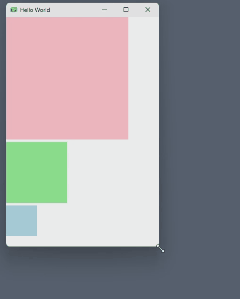
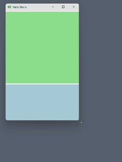
That’s what we wanted, and now when we stretch the window vertically, the rectangles always maintain the given ratio. The green rectangle is always half the height of the pink one, and the blue one is always half the height of the green one (and therefore a quarter of the height of the pink one).
In the absence of maximum or minimum values, you can even simplify the preferred heights down to the proportions you want. For example, the example above will behave exactly the same if you change the Layout.preferredHeight values to 4, 2, and 1! Sometimes I’ll do that if I don’t care about the absolute sizes and just want to express that elements should be sized in a 4:2:1 ratio (or whatever ratio you’re looking to achieve). But be aware that this is only the case when all child elements of the layout are set to fill in that direction, and they all have a preferred size in that direction.
Lesson 5: If the layout itself has a specified size, AND all child objects use Layout.fillWidth/Height, AND all child elements have a preferredWidth/Height set, then the proportion of the fill allocated to each child will be the ratios of the preferredWidth/Height!
Let’s dig a little deeper. What if we don’t specify the vertical height of the layout? In other words, what if we only anchor the layout’s left and right sides to the window?
import QtQuick

   import QtQuick.Layouts


   Window {

       width: 320

       height: 480

       visible: true

       title: qsTr("Hello World")


       ColumnLayout {

           anchors.left: parent.left

           anchors.right: parent.right


           Rectangle {

               color: "pink"

               Layout.fillHeight: true

               Layout.fillWidth: true

               Layout.preferredHeight: 256

           }


           Rectangle {

               color: "lightGreen"

               Layout.fillHeight: true

               Layout.fillWidth: true

               Layout.preferredHeight: 128

           }


           Rectangle {

               color: "lightBlue"

               Layout.fillHeight: true

               Layout.fillWidth: true

               Layout.preferredHeight: 64

           }

       }

} |
 |
At the bottom, there’s some white space now. The layout isn’t anchored to the window’s top and bottom, so the rectangles are always their “preferred” heights, even when we stretch the window vertically. The Layout.fillHeight properties don’t do anything here. The layout doesn’t know what space it has available to fill if it doesn’t have a parent controlling its size in that direction! The only information the layout can use to control its own height is the sum of the implicit heights of its children (provided by their Layout.preferredHeight properties). The Layout.fillHeight properties are simply ignored.
OK, so what happens if we don’t fill height, but we do have the layout anchored to all four sides of the window?
import QtQuick

   import QtQuick.Layouts


   Window {

       width: 320

       height: 480

       visible: true

       title: qsTr("Hello World")


       ColumnLayout {

           anchors.fill: parent


           Rectangle {

               color: "pink"

               // Layout.fillHeight: true

               Layout.fillWidth: true

               Layout.preferredHeight: 256

           }


           Rectangle {

               color: "lightGreen"

               // Layout.fillHeight: true

               Layout.fillWidth: true

               Layout.preferredHeight: 128

           }


           Rectangle {

               color: "lightBlue"

               // Layout.fillHeight: true

               Layout.fillWidth: true

               Layout.preferredHeight: 64

           }

       }

} |
 |
Now the layout knows what height the rectangles like to be, but it was not told to resize them with a Layout.fillHeight. So, the layout stretches, and the rectangles get repositioned, but they do not get resized vertically. If you reduced the Layout.preferredHeight values to 4, 2, and 1, what happens?
import QtQuick

   import QtQuick.Layouts


   Window {

       width: 320

       height: 480

       visible: true

       title: qsTr("Hello World")


       ColumnLayout {

           anchors.fill: parent


           Rectangle {

               color: "pink"

               Layout.fillWidth: true

               Layout.preferredHeight: 4

           }


           Rectangle {

               color: "lightGreen"

               Layout.fillWidth: true

               Layout.preferredHeight: 2

           }


           Rectangle {

               color: "lightBlue"

               Layout.fillWidth: true

               Layout.preferredHeight: 1

           }

       }

} |
 |
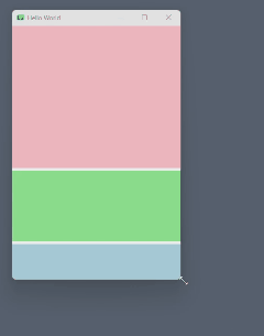
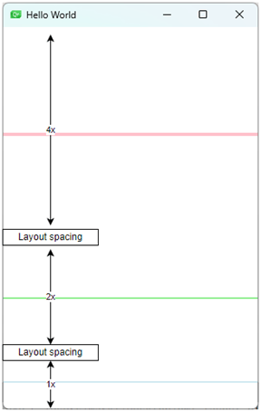
Interesting. You get very slim horizontal lines that are not spaced out uniformly. The layout uses the Layout.preferredHeight properties to allocate proportional chunks of space (see the annotated figure below), but the rectangle placed in that space has exactly the height specified by the Layout.preferredHeight property.
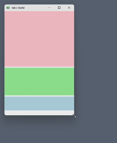
Now, the last test we’ll do on sizing: setting the Layout.preferredHeight of a subset of child elements. For example, let’s say we put Layout.fillHeight back in there and remove the Layout.preferredHeight from the pink rectangle only (and restore the larger sizes 256, 128, and 64):
import QtQuick

   import QtQuick.Layouts


   Window {

       width: 320

       height: 480

       visible: true

       title: qsTr("Hello World")


       ColumnLayout {

           anchors.fill: parent


           Rectangle {

               color: "pink"

               Layout.fillWidth: true

               Layout.fillHeight: true

               // Layout.preferredHeight: 256

           }


           Rectangle {

               color: "lightGreen"

               Layout.fillWidth: true

               Layout.fillHeight: true

               Layout.preferredHeight: 128

           }


           Rectangle {

               color: "lightBlue"

               Layout.fillWidth: true

               Layout.fillHeight: true

               Layout.preferredHeight: 64

           }

       }

} |
 |
The pink rectangle is very small... it's easy to miss, but it's there. It does grow and shrink a little when resizing, but not much. The proportions of the green & blue rectangles are correctly maintained, but the QML engine doesn’t really have much information about what to do with the pink one. For the sake of being thorough, let’s reduce the Layout.preferredHeight of the green & blue rectangles to a simple 2:1 ratio:
import QtQuick

   import QtQuick.Layouts


   Window {

       width: 320

       height: 480

       visible: true

       title: qsTr("Hello World")


       ColumnLayout {

           anchors.fill: parent


           Rectangle {

               color: "pink"

               Layout.fillWidth: true

               Layout.fillHeight: true

               // Layout.preferredHeight: 4

           }


           Rectangle {

               color: "lightGreen"

               Layout.fillWidth: true

               Layout.fillHeight: true

               Layout.preferredHeight: 2

           }


           Rectangle {

               color: "lightBlue"

               Layout.fillWidth: true

               Layout.fillHeight: true

               Layout.preferredHeight: 1

           }

       }

} |
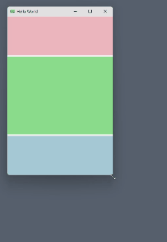 |
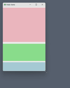
The QML engine still maintains the correct ratio for the child elements with a specified Layout.preferredHeight, but the amount of space allocated for the pink one is different. This is all academic... I don't know what the use case for this would be. My only goal is to demonstrate how things behave and establish some rules.
Lesson 6: If all children of a layout are set to fill in the direction of the layout, either give all of them a Layout.preferredHeight/Width, or none of them.
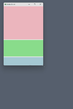
Step 9: Additional Constraints
The minimum/maximum height and width properties can also be set. This allows the rectangles to resize, but only to a certain minimum or maximum size. In this case, we’ll put a maximum height on the pink rectangle. When resized, that rectangle will grow up to 384 pixels. It won’t get any taller, but the blue and green rectangles will continue to maintain their 2:1 ratio. In this case, it doesn’t matter if we use 256:128:64 or 4:2:1, the behavior is the same:
import QtQuick

   import QtQuick.Layouts


   Window {

       width: 320

       height: 480

       visible: true

       title: qsTr("Hello World")


       ColumnLayout {

           anchors.fill: parent


           Rectangle {

               color: "pink"

               Layout.fillWidth: true

               Layout.fillHeight: true

               Layout.preferredHeight: 4

               Layout.maximumHeight: 384

           }


           Rectangle {

               color: "lightGreen"

               Layout.fillWidth: true

               Layout.fillHeight: true

               Layout.preferredHeight: 2

           }


           Rectangle {

               color: "lightBlue"

               Layout.fillWidth: true

               Layout.fillHeight: true

               Layout.preferredHeight: 1

           }

       }

} |
 |
We can continue to add additional constraints, and the QML engine will do its best to resize based on all of them.
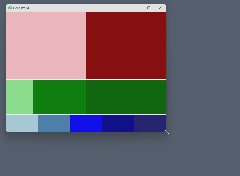
Step 10: A Fancy Window with Nested Layouts
Let’s take it up a notch by maintaining the 4:2:1 ratio of rows, and in each of those, let’s put a RowLayout. We’ll add more rectangles in various proportions in each of those rows. Let’s also set the spacing on the rows to zero, but leave the column layout’s spacing as the default value (5 pixels). A lot changed here, so I'll skip the highlighting:
import QtQuick

   import QtQuick.Layouts


   Window {

       width: 640

       height: 480

       visible: true

       title: qsTr("Hello World")


       ColumnLayout {

           anchors.fill: parent


           RowLayout {

               Layout.fillWidth: true

               Layout.fillHeight: true

               Layout.preferredHeight: 4


               spacing: 0


               Rectangle {

                   color: "pink"

                   Layout.fillWidth: true

                   Layout.fillHeight: true

               }


               Rectangle {

                   color: "darkRed"

                   Layout.fillWidth: true

                   Layout.fillHeight: true

               }

           }


           RowLayout {

               Layout.fillWidth: true

               Layout.fillHeight: true

               Layout.preferredHeight: 2


               spacing: 0


               Rectangle {

                   color: "lightGreen"

                   Layout.fillWidth: true

                   Layout.preferredWidth: 1

                   Layout.fillHeight: true

               }


               Rectangle {

                   color: "green"

                   Layout.fillWidth: true

                   Layout.preferredWidth: 2

                   Layout.fillHeight: true

               }


               Rectangle {

                   color: "darkGreen"

                   Layout.fillWidth: true

                   Layout.preferredWidth: 3

                   Layout.fillHeight: true

               }


           }


           RowLayout {

               Layout.fillWidth: true

               Layout.fillHeight: true

               Layout.preferredHeight: 1


               spacing: 0


               Rectangle {

                   color: "lightBlue"

                   Layout.fillWidth: true

                   Layout.fillHeight: true

               }


               Rectangle {

                   color: "steelBlue"

                   Layout.fillWidth: true

                   Layout.fillHeight: true

               }


               Rectangle {

                   color: "blue"

                   Layout.fillWidth: true

                   Layout.fillHeight: true

               }


               Rectangle {

                   color: "darkBlue"

                   Layout.fillWidth: true

                   Layout.fillHeight: true

               }


               Rectangle {

                   color: "midnightBlue"

                   Layout.fillWidth: true

                   Layout.fillHeight: true

               }

           }

       }

} |
 |
Step 11: Using Real Controls
I mentioned previously that Rectangle objects don’t have an implicit size, but Button objects do (note that we need to add import QtQuick.Controls to get the Button object). Let’s see how that changes things. First, let’s strip it down to something like what we had way back in Step 4. The layout is not anchored, and it contains two buttons:
import QtQuick

   import QtQuick.Layouts

   import QtQuick.Controls


   Window {

       width: 320

       height: 480

       visible: true

       title: qsTr("Hello World")


       ColumnLayout {

           Button {

               text: "Top button is...short"

           }


           Button {

               text: "Bottom button is...long"

           }

       }

} |
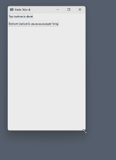 |
Nothing terribly interesting there, but when the layout wasn't anchored before (with just Rectangles), we couldn't see the contents at all. However, Buttons do have an implicit size, whereas Rectangles don't. You can see that the Buttons are as wide as they need to be to accommodate their text, and the layout stays "fitted" to the implicit size of those buttons. As a consequence, the buttons neither resize nor reposition when the window is resized.
Now let’s say we want to fill the buttons in both directions:
import QtQuick

   import QtQuick.Layouts

   import QtQuick.Controls


   Window {

       width: 320

       height: 480

       visible: true

       title: qsTr("Hello World")


       ColumnLayout {

           Button {

               text: "Top button is...short"

               Layout.fillWidth: true

               Layout.fillHeight: true

           }


           Button {

               text: "Bottom button is...long"

               Layout.fillWidth: true

               Layout.fillHeight: true

           }

       }

} |
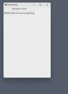 |
That’s a little more interesting. The buttons don’t fill the height and width of the whole Window, they fill the height and width of the ColumnLayout, and we didn’t say anything about how big the ColumnLayout should be. That is, we didn’t anchor it to the Window. It is not itself inside another layout, etc. The layout therefore just has its implicit size. The implicit height is the sum of its children’s implicit heights (plus spacing), and its implicit width is the maximum width of its children. So, when the children tell their parent layout to resize them to fill the layout’s height, nothing changes (because they already do), and, when they tell the parent layout to fill the layout’s width, really all that happens is that the narrower button fills to the same width as the wider one. Obviously, a RowLayout will behave the same, but in the horizontal direction instead.
Let’s anchor the layout to the Window and fill width (but not height):
import QtQuick

   import QtQuick.Layouts

   import QtQuick.Controls


   Window {

       width: 320

       height: 480

       visible: true

       title: qsTr("Hello World")


       ColumnLayout {

           anchors.fill: parent


           Button {

               text: "Top button is...short"

               Layout.fillWidth: true

               // Layout.fillHeight: true

           }


           Button {

               text: "Bottom button is...long"

               Layout.fillWidth: true

               // Layout.fillHeight: true

           }

       }

} |
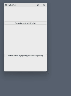 |
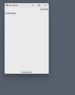
Now both buttons stretch across the Window and are spaced out such that the column is divided in half vertically, and each button is in the vertical center of its half.
Step 12: Alignment
We probably don’t want those buttons to be haphazardly floating in the middle of their space. We probably want them either both at the top, both at the bottom, or one at the top and the other at the bottom. All of this can be achieved, but first we need to understand the quirks of the Layout.alignment property.
First, look at the window we created and notice the language I used above. The two buttons are not spaced equally relative to the height of the layout. There's twice as much space between the buttons as there is between the top button and the top of the window. Conceptually, the layout’s full height is divided in half, creating two "cells," and each button hovers in the center of its “cell.” This is important because the Layout.alignment property will align a button within its “cell,” not relative to the whole layout! So, if we align both buttons to the top, they will not both be at the top of the window. They are each at the top of their own “cell,” which leaves the bottom button hovering somewhere in the middle of the window:
import QtQuick

   import QtQuick.Layouts

   import QtQuick.Controls


   Window {

       width: 320

       height: 480

       visible: true

       title: qsTr("Hello World")


       ColumnLayout {

           anchors.fill: parent


           Button {

               text: "Top button is...short"

               Layout.fillWidth: true

               Layout.alignment: Qt.AlignTop

           }


           Button {

               text: "Bottom button is...long"

               Layout.fillWidth: true

               Layout.alignment: Qt.AlignTop

           }

       }

} |
 |
If the bottom button had instead used Layout.alignment: Qt.AlignBottom, then the top button would be at the top of the window and the bottom button would be at the bottom of the window. If we want both at the top, Layout.alignment isn’t what we want. We have a couple options for that:
- Instead of anchoring the ColumnLayout with
anchors.fill: parent, we can just anchor it to the Window’s left and right sides. Then, the buttons will fill the width of the Window, but the layout will only take up as much height as the two buttons (plus any ColumnLayout spacing). The buttons will both be stacked at the top.
- We can let the layout take up the whole height, and then add a dummy
Item after the second button that will eat up all available height, pushing the two buttons up to the top, like this:
import QtQuick

   import QtQuick.Layouts

   import QtQuick.Controls


   Window {

       width: 320

       height: 480

       visible: true

       title: qsTr("Hello World")


       ColumnLayout {

           anchors.fill: parent


           Button {

               text: "Top button"

               Layout.fillWidth: true

           }


           Button {

               text: "Middle button"

               Layout.fillWidth: true

           }


           Item { Layout.fillHeight: true }


           Button {

               text: "Bottom button"

               Layout.fillWidth: true

           }

       }

} |
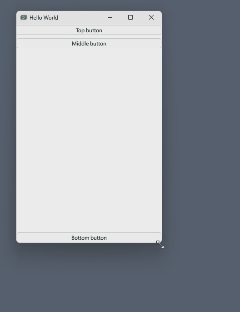 |
This is useful because now we can also add a button at the very bottom. We wouldn’t be able to achieve this with the alignment properties unless we divided up the layout’s “cells” just right, which wouldn’t be worth the hassle. Otherwise, we'd have to nest another ColumnLayout inside the outer one and use it to keep the top two buttons together.
Lesson 7: Dummy Items used as spacers can often give you better control of where things are positioned in the direction of the layout’s ordering of elements.
I prefer to use spacer Items instead of Layout.alignment, at least with regard to alignment in the direction of the layout. If we wanted things to be aligned left or right in a ColumnLayout (or top/bottom in a RowLayout), then Layout.alignment makes sense:
import QtQuick

   import QtQuick.Layouts

   import QtQuick.Controls


   Window {

       width: 320

       height: 480

       visible: true

       title: qsTr("Hello World")


       ColumnLayout {

           anchors.fill: parent


           Button {

               text: "Top button"

               // Layout.fillWidth: true

               Layout.alignment: Qt.AlignRight

           }


           Button {

               text: "Middle button"

               // Layout.fillWidth: true

               Layout.alignment: Qt.AlignLeft

           }


           Item { Layout.fillHeight: true }


           Button {

               text: "Bottom button"

               // Layout.fillWidth: true

               Layout.alignment: Qt.AlignHCenter

           }

       }

} |
 |
Lesson 8: When positioning items on the axis that the layout does not control, the Layout.alignment property is more useful than it is on the axis that the layout does control.
Summary
Layouts are a modern and flexible method for creating nicely-resizable QML user interfaces. Until you have some time to play with them and see how they behave, they can seem unintuitive. I have learned several lessons the hard way, and I will reiterate them here for your comfort and convenience:
- The implicit height and width of
Rectangles are zero.
- Unless you tell Qt where to put stuff, it won’t know, and it has no problem letting things overlap.
Layouts, like Rectangles, have zero implicit width/height.- If an object is a child of a
Layout, don't set explicit size properties of the child: only use the Layout.* properties to delegate those duties to the Layout.
- If the layout itself has a specified size, AND all child objects use
Layout.fillWidth/Height, AND all child elements have a Layout.preferredWidth/Height set, then the proportion of the fill allocated to each child will be the ratios of the preferredHeight/Widths!
- If all children of a layout are set to fill in the direction of the layout, either give all of them a
preferredHeight/Width, or give them neither.
- Dummy
Items used as spacers can often give you better control of where things are positioned in the direction of the layout’s ordering of elements.
- When positioning items on the axis that the layout does not control, the
Layout.alignment property is more useful than it is on the axis that the layout does control.
Building a Qt App?
I’d love to help! Give us a call or send us an email to discuss! Learn more about our Web Application Development solutions and contact us today for your next project!