Ignition is a widespread, robust Industrial SCADA platform. Perspective is a visualization module within Ignition that allows the creation of HTML applications for everything from simple plant floor HMIs to a remote user's computer. One of Perspective’s major strengths is its mobile-friendly design nature.
Behind Ignition Perspective are traditional web technologies such as HTML and CSS. Ignition Perspective abstracts away some of the traditional web development from developers using Ignition to develop Ignition Applications. Developers get a streamlined development platform that makes it easier to stand up applications quickly and more easily interface with more of Ignition's built-in backend functionality.
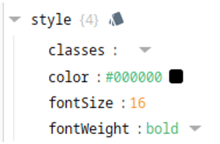
That being said, Ignition Perspective essentially offers complete access to all the standard CSS properties within the web development world. For the majority of development, styling can be attached to perspective components with Ignition's styling GUI. Every perspective component has a 'style' property where CSS properties can be attached.
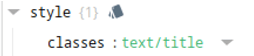
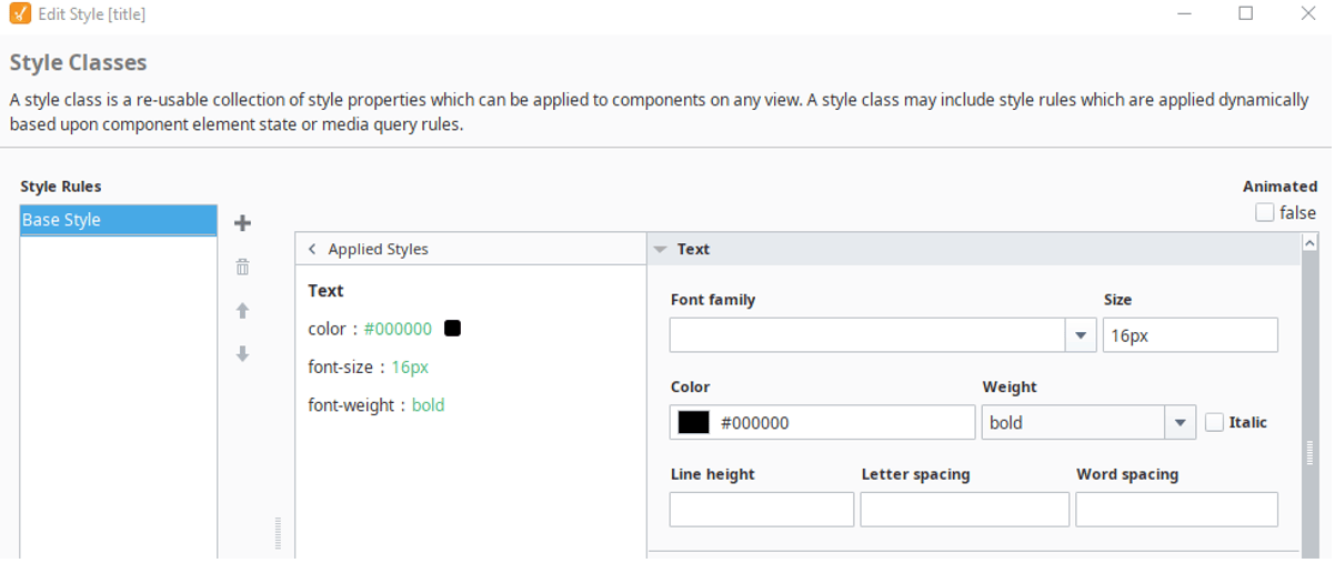
Ignition also lets developers create style classes that contain reusable groupings of styles. Perspective components can then reference a single style class or multiple style classes. Additional basics on style classes can be found in the Ignition User Guide.
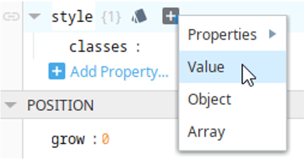
The Ignition designer style GUI does an excellent job of organizing and easily exposing common CSS properties; however, The GUI is limited and doesn’t expose all possible CSS properties. The ‘properties’ dropdown under styles is more comprehensive. Any CSS property can also be added by manually adding a value.
It's important to note that the added styles have their keys in camelCase rather than kebab-case. Kebab-case is the formatting for generic CSS; however, Ignition uses React and Javascript, which require the camelCase formatting.
So, what functionality and styling are we missing out on if Ignition Developers only use the CSS properties presented through the Style GUI in the designer? The styling possibilities are limitless, but I'll showcase a couple powerful styling properties we can add to any Ignition Perspective Component.
The Transform Property
The transform CSS property allows developers to change the position, orientation, scale, and viewing perspective of components on screen in a multitude of ways. The full capabilities on the transform property can be read about in other resources. We'll keep it fairly simple for now.
For this demo, I’ve added a Flex Row to the center of my view. I’ve changed the ‘justify’ property to space-evenly so that it keeps some room in between the buttons. I also added a background color solely for the demo to give some context for where the flex row is. An important property I did change was the overflow, which I set to visible. In this case, these transforms extend past the bounding box of the flex row. Changing the overflow to visible keeps the buttons from being cut off.
The demo has 5 buttons added inside the flex row. The first button has no transform applied to it but the other four do. To add the transform property, select the button and go to its style. Click the plus icon and then select value from the dropdown. Change the key of the value to ‘transform.’ The value can be any transform you want to add, following the transform property's styling requirements.
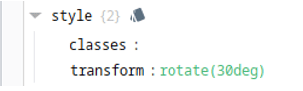
The transformed buttons have the following transform properties:
- rotate(30deg)
- translateY(60px)
- scale(1.5)
- skew(10deg, 20deg)
Multiple transforms can be applied at the same time. For instance, the following transform property value will both scale and rotate the component.

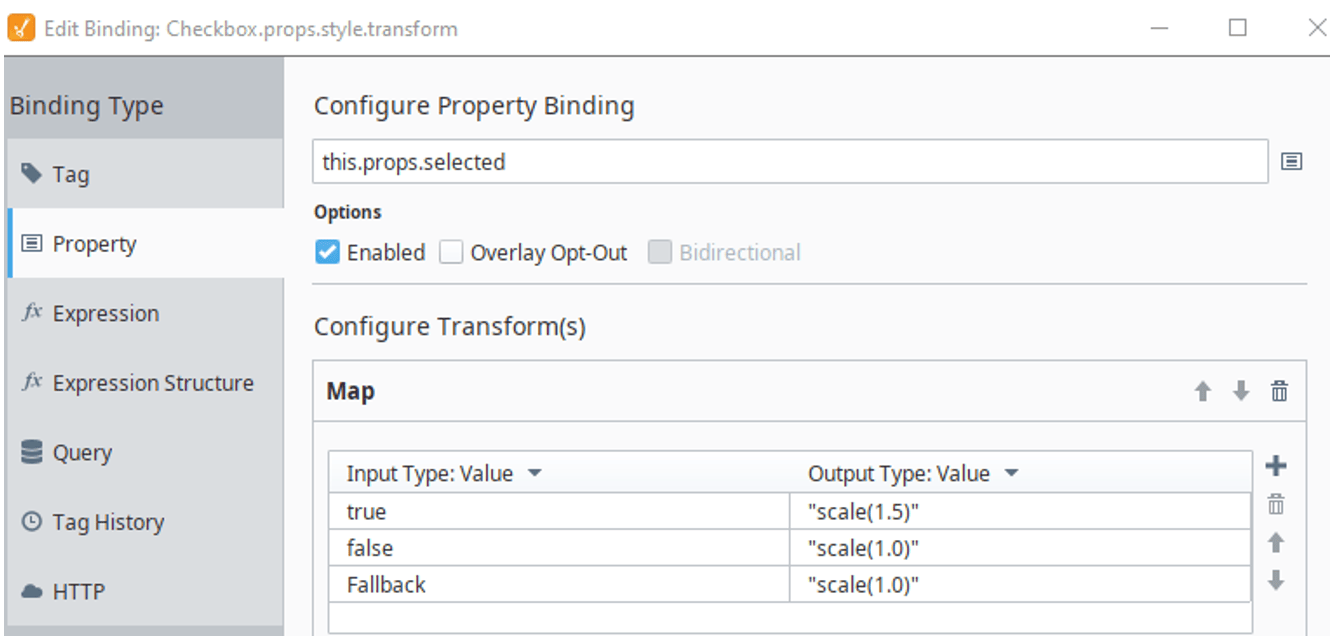
Transforms don't just need to be static either. You can leverage Ignition's expression bindings. In another example, we can add a check box to a view and give it the style transform property with a binding.
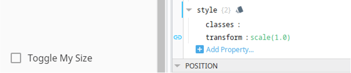
The binding can map the selection of the checkbox to a scale transform applied to the checkbox itself. So, when the checkbox is checked, it scales to 1.5 and, when it is not checked, it scales to normal size.
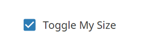
The end result is a checkbox that instantly grows and shrinks as it is selected/unselected. This changing transform can create more dynamic displays that allows designers to be more creative with our HMI's. The transform is instantaneous and quite a shocking change to happen immediately, but there's a remedy for that with the transition CSS property.

The Transition Property
The transition property allows the animation of changing CSS properties. Full details and formatting of this property can be read about in other sources. For these demonstrations, let’s add the transition property to the scaling checkbox.
- Select the checkbox and add the transition key to the style.
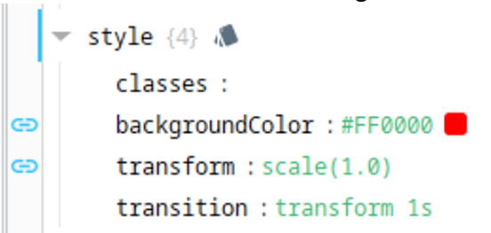
- Set the value of transition to 'transform 1s.' This is telling the transition to only apply to the transform property and to animate for 1 second.
That's all that it needs to animate the transition. The new result is a growing and shrinking checkbox upon selection. The transition feels more natural and creates a pretty cool effect.

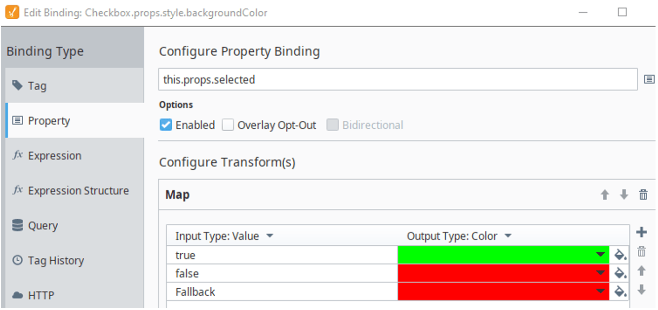
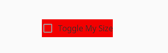
We applied a transition to the transform property, but we also can apply transitions to a large number of other CSS properties. For instance, let's try with a background color. First I'll add a dynamic background color that changes from red to green based on whether the check box is selected.
I start by adding the ‘backgroundColor' property to the style of the checkbox and then adding a binding that switches between red and green based on the 'props.selected' property.
Now I'm ready to add a second transition to the checkbox. All I need to do is adjust the transition property to include the background-color changing over the course of 1 second. Separate multiple transitions with commas. Now the checkbox will also start to transition its background over the course of a second rather than instantaneously.

Transition doesn't work with every CSS property, but it works with a large amount of them. You can determine which properties it works with through some simple searching online. Transitions can also include delays at their start as well as different animation timing functions. There are countless resources online to learn more about the transition property.
In Conclusion
The Transform and Transition CSS properties are powerful on their own, but the real power of CSS styling comes with unique and creative combination of all sorts of CSS styling together. Ignition exposes any possible CSS property to developers, but developers should still consider the full extent of CSS that we can use on the web. This blog is only scratching the surface on some of the more advanced CSS that can be added to your Ignition Perspective Projects. Ignition also allows direct CSS code to be written and used throughout Perspective projects either through importing your own theme or with the stylesheet introduced in Ignition 8.1.22.
Learn more about DMC's Ignition programming expertise, and contact us today for your next project.