Qt is a popular open-source framework for creating user interfaces for both desktop and mobile applications. PySide is the library of Python bindings for the Qt framework, which allows you to develop dynamic UIs using Python, and is currently the tool of choice for data science. Qt has its own markup language called QML that we often use to design professional-looking user interfaces quickly and easily. When it comes to graphical elements like graphs, integrating Python and QML can get confusing. In this example, I’ll go over how to implement a QtChart object in a PySide6/QML application.
Note: this example assumes that you already have a barebones PySide6/QML project set up.
Let’s start with the QML part. Create a ChartView object inside the QML layout of your choice. Within the ChartView, we will need to create two ValueAxis objects (one for X and one for Y) and an AbstractSeries object. There are a number of different AbstractSeries types to choose from, but we’ll go with a ScatterSeries for now. Within the ScatterSeries, designate the ValueAxes as the X and Y axes.
ChartView { //Plot
        id: mainPlot

        //Layout-specific parameters
        Layout.row: 0
        Layout.rowSpan: 2
        Layout.column: 1
        Layout.columnSpan: 2
        Layout.fillHeight: true
        Layout.fillWidth: true
        Layout.preferredWidth: Layout.columnSpan
        Layout.preferredHeight: Layout.rowSpan

        title: "Example Plot"
        legend.visible: false

        ValueAxis {
            id: axisY
            min: 0
            max: 1
            titleText: "Y-Values"
        }

        ValueAxis {
            id: axisX
            min: 0
            max: 20
            titleText: "X-Values"
        }

        ScatterSeries {
            id: plotSeries
            name: "ScatterSeries"
            axisX: axisX
            axisY: axisY
        }
    }
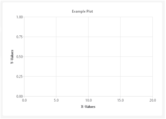
When you run your application, the ChartView should look something like this:
Looks pretty good so far, but there’s one major component missing: the data! Python is great for number-crunching and data management, so your application will very likely implement some kind of data model in Python that we will then visualize on our QML UI. For this example, we will make three Qt Signals, one each for adding data, removing data, and scaling the axes.
new_point_added = Signal(QPointF) # add point to graph on test screen from DAQ
clear_graph_requested = Signal() # clear all points from graph
scale_graph_requested = Signal(float, float, int) # send axis scaling to graph
Then, in the QML file, we will define connections to those Signals. I chose to make these connections in a GridLayout object that contains the ChartView, but it can be done anywhere, as long as the connect() methods execute before the user interacts with the UI. When the GUI receives a “new_point_added” Signal with a QPointF payload, it will append that point to the ScatterSeries. When it receives a “clear_graph_requested” Signal, it will clear all the points in the ScatterSeries. Finally, when it receives a “scale_graph_requested” Signal with a payload of X and Y axis ranges, it will apply those ranges to the ValueAxis objects.
The Python object that will emit those signals can be an instance of any class that inherits QObject. For QML to have access to a Python object, you will also need to set it as a “context property.” For example, the code below allows QML to access a QObject-derived object called my_object using the string “main.”
qml_app_engine = QQmlApplicationEngine()
qml_context = qml_app_engine.rootContext()
qml_context.setContextProperty("main", my_object)
Now we can connect the signals main.new_point_added, main.clear_graph, and main.scale_graph to slots in QML to manipulate the series and axes. An easy place to make those connections is in the Component.onCompleted slot of some object related to them.
ChartView { //Plot
    Component.onCompleted: {
        main.new_point_added.connect(function (p) {
            plotSeries.append(p.x, p.y)
        })
        main.clear_graph.connect(function() {plotSeries.clear()})
        main.scale_graph.connect(function(ymax, ymin, xmax) {
            axisY.max = ymax
            axisY.min = ymin
            axisX.max = xmax
        })
    }
…
Those signals need to be emitted from the Python object that serves as your context property. As an example, the class method below takes in a list of numeric values, scales the graph, and sends the data as a series of points to the QML GUI.
@Slot(list) #clear, scale, and display new data
    def send_data_to_ui(self, dataList):
        self.clear_graph.emit() #clear plot before adding new data

        ySpan = max(dataList) - min(dataList) #calculate x and y axis ranges
        yMid = (max(dataList) + min(dataList)) / 2
        yMax = yMid + (ySpan/2)
        yMin = yMid - (ySpan/2)
        xMax = len(dataList)
        self.scale_graph.emit(yMax, yMin, xMax)

        for i in range(len(dataList)): #loop through data, send each point
            self.new_point_added.emit(QPointF(i, dataList[i]))
With all the pieces in place, we just need a way to call the send_data_to_ui method from the GUI. In the QML file, create a Button on the UI that we can use to populate the graph. You can get your data from anywhere, but, for this example, I made a simple start_test function in Python that generates random numbers and feeds it to send_data_to_ui.
Button { //Measure Button
    id: startButton
    Layout.fillHeight: true
    Layout.fillWidth: true
    text: qsTr("Start Test")
    onClicked: main.start_test()
}

Again, notice that we use “main,” the name that we gave the context property, to access a method of the object on the Python side. When you run your application and click that button, you’ll see something like this in your ChartView:
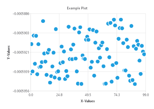
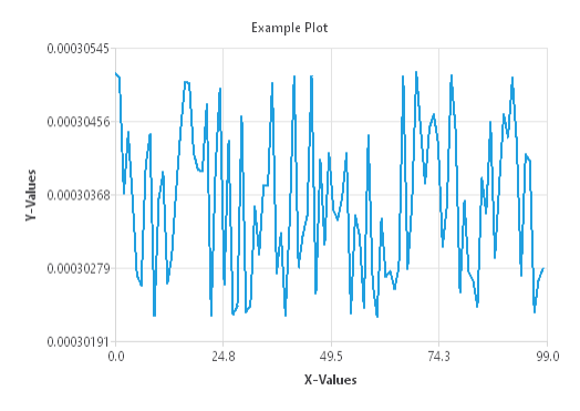
Wow, a genuine counterfeit Jackson Pollock painting. Now try playing around with the ChartView parameters. For example, let’s change the ScatterSeries to a LineSeries and observe the difference:
Congratulations, you can now create flexible, resizable, dynamically updating charts and graphs on (almost) any platform!
Learn more about our PC Application Development and our Test & Measurement Automation expertise, and contact us today for your next project.