Why do we code PLCs, design HMIs, create complex SCADA networks? The short answer is - so that somebody can use them to get a job done. For an HMI to be useable, it must be readable. Readability isn't just a matter of word choice. Technical choices like text alignment, line width, or font size can make or break readability. Here are eight tips for ensuring readability in your HMIs:
1. Left-align Text
Likewise, justifying text creates awkward gaps that interrupt the visual flow. If text is left-aligned, left-align the titles too. Never center-align a title over left-aligned text, or the tile will look like it accidentally wandered off.
2. Right-align Number Columns
Align the titles with the columns; left for text, right for numbers. Specify the same number of decimal places for all columns so that the numbers line up for easy comparisons. If there's more than one row of text in a cell, top-align to make reading across easier. Center alignment disorients, as seen below.
Left/right alignment create strong column relationships.
3. Set Line Width at 50-60 Characters
When lines get very long, you can get lost in the line or have difficulty finding the beginning of the next line, especially if the paragraph is long. Keeping lines at 50-60 characters per line (including spaces) helps the reader keep their place. Readers will get lost if it's too long, even if it's just a single line.
Unfortunately, most programs' defaults will not allow customization of line width. Microsoft Word defaults a line width of ~100 characters, OneNote defaults to ~120 characters. Use this simple tool or Microsift Word's built-in feature to measure characters per line.
4. Keep Text Contrast High
The third example is much harder to read. A quick tip - squint your eyes and look at the text box. If you can still see that there's text, then your color scheme has good contrast. If the text blends into the background increase the contrast.
5. Make Your Text Big Enough
The default in most programs is size 11pt for sans serif fonts and size 12pt for serif fonts. These are appropriate sizes for most typical computer use. As soon as you stray from typical use (e.g. dim or bright environment, HMI at table/hip level, must read quickly, etc.) those font sizes are generally too small. Here's a useful resource to help determine the minimum text size for a viewing distance. Try to stay a few sizes above minimum for comfortable reading.
6. Use Emphasis Sparingly
Thoughtful emphasis provides clarity and guidance. Too much emphasis (like this) is distracting.
Bold draws the eye. Use it to make things stand out.
Italics is gentler and good for sub-titles and side-notes. Keep in mind that it's harder to read than normal or bold text.
Underline is not appropriate for typed text and is usually distracting.
ALL CAPS are actually hard to read because the letters are more like each other than lower case letters. This also comes across as "screaming" and should generally be avoided. Likewise, you may find that Title Case Is Not As Easy To Read, while sentence case is easier.
Use only one type of emphasis at a time. Not like this. This is too much.
7. Important Things Go in the Upper Left
Place important information from left-to-right, and top-to-bottom. English-readers often view pages in an F-shaped pattern, as demonstrated in this Nielsen eye-tracking study:
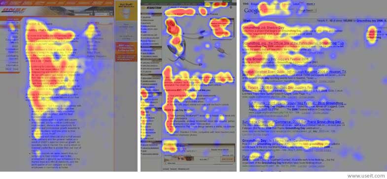
The top-left area is read first, so it is appropriate for a title, starting instructions, and vital messages. The left edge is the strongest. The left edge is just as strong as the top row of text. Keep this in mind when placing HMI elements. The middle of the left edge may be perceived more strongly by the reader than the top right. The bottom right is the weakest. Don't put vital status messages here. "Next" buttons are appropriate. Low-priority status messages work well in the bottom left.
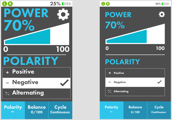
8. Give it Room to Breathe
We all need a little room to breathe. Your content is no different. "White space" or "negative space" is the area around your content. It's just as important as placement when it comes to guiding your reader around the screen.
Example courtesy of Sam Levin, DMC.
The example on the left is choked up and feels crowded, difficult to navigate. The example on the right has room to breathe and flow, it's easier to focus on the content.
Additional Resources
Still curious? Here's more resources: MRW Web Design, No Justification: Don’t Use Right, Center, and Full Justification on the Web Ambrose Designs, Readability: Aligning Text
I hope these tips give you something to consider when designing your next HMI project! Questions? Examples? Agree to disagree? Tell us in the comments!
Learn more about DMC's HMI and SCADA programming expertise.