I recently developed an HMI using WinCC 7.4 for an automation project. Building it from the ground up afforded me the opportunity to deviate from WinCC’s default skeuomorphic controls and instead experiment with more modern, flatter UI elements found on consumer-facing products like smartphones and web interfaces (think Facebook, Google, and Apple).
I relied on WinCC’s faceplate types to create generic controls that could be dragged and dropped as needed without additional overhead. I wanted this interface to feel comfortable for operators, so I opted for a design that mirrored interfaces with which users would feel more familiar.
In this post, I'll discuss my custom toggle switch control.
When to Use a Toggle Switch
Toggle switches, like light switches, should be used to control binary operations that go into effect immediately (as opposed to a checkbox that is usually coupled with an Apply, Submit, or Next button).
Functionally, toggle switches follow a standard across platforms; right and colored indicates a "powered" or "enabled" state, and left and grey means "off" or "disabled." However, each company designs its control a little differently to give a unique feel.
Here are designs that some high-profile companies use:
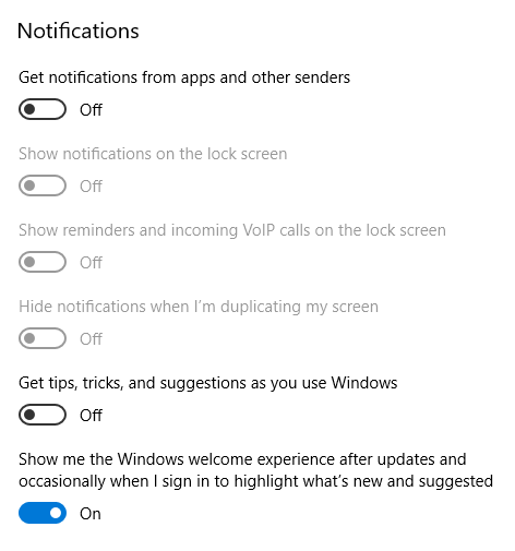
Img 1: Microsoft Windows 10
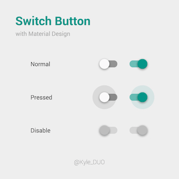
Img 2: Google Android
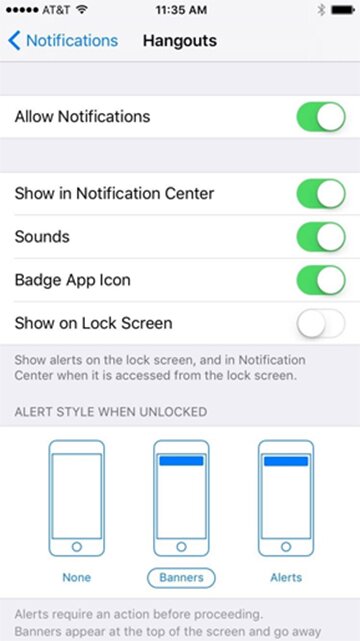
Img 3: Apple iOS
How to use the ToggleSwitch in WinCC 7
I made two variations of my toggle switch. The regular fptToggleSwitch faceplate has properties for displaying text within the switch. Deprecated due to its ambiguity, this style does not follow best practices for some designers.
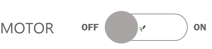
The text could arguably indicate either state or action (if the switch says on, does that mean it is currently on? Or will pressing it cause it to turn on?). An alternative standard is to simply remove text, and let the fact that ‘right’ and ‘colored’ indicate ‘on’, while ‘left’ and ‘non-colored’ indicate ‘off’. To further reduce ambiguity, the fptToggleSwitch_OuterText faceplate might be more appropriate, which displays text on either side of the switch. This method solidifies the intended functionality.
I’ve attached the files for both types of switches. Feel free to use as-is or customize it to tailor it more to your application.
Files
ToggleSwitch Faceplates
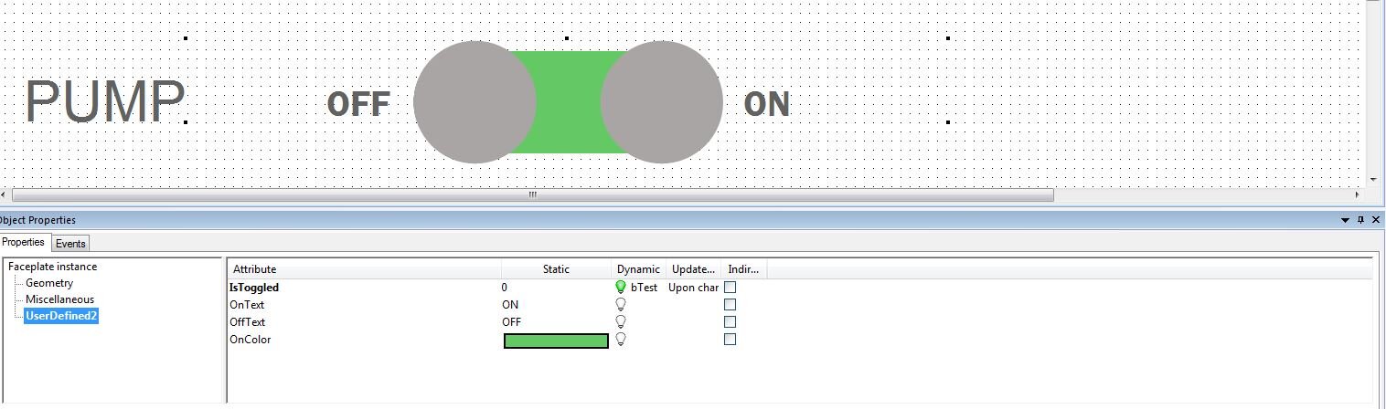
- IsToggled: Tie this property to the tag corresponding to the status of the device or bit that the switch is toggling.
- OnText: For the regular faceplate, this is the text that is displayed when the switch is toggled on. For the outer text faceplate, this is the text that is shown on the right side of the switch.
- OffText: For the regular faceplate, this is the text that is displayed when the switch is toggled off. For the outer text faceplate, this is the text that is shown on the left side of the switch.
- OnColor – Color helps indicate the state of the switch to the operator. It is standard practice for the presence/absence of color to represent on/off, enabled/disabled, true/false, etc. The OnColor property defines the color of the switch when it is on. Choose a color that matches the color scheme of your project.
Don’t forget to set an event for when the control is pressed!
See the Switch in Action
Conclusion
Intuitive and user-friendly interfaces aren’t just for picky consumers; they can greatly improve the usefulness and effectiveness of a machine. Users who can better navigate and operate their machine are less likely to make mistakes that can cause unplanned downtime.
Check out our HMI and SCADA programming and User Interface Design pages to see what DMC can do to improve your machine interface!