In this blog, we will discuss some useful strategies for managing font size in Ignition Perspective across multiple display resolutions and zooms. Specifically, we will cover:
- Limitations of Absolute Font Sizes
- CSS for Font Sizing in Ignition Perspective
- Strategies for implementing Viewport Sized Typography
Limitations of Absolute Font Sizes
Today is an exciting day; the dashboards that you have been developing using Ignition Perspective are going to be released to production. You save one last time to capture your final tweaks and launch a session in a browser on your laptop to ensure all of your views look perfect, and they do!
You then deploy a dashboard on the large 4k TV that overlooks Area 1, and you are shocked at what you see. The shapes on the dashboard grew to fit the space on the TV, but the text didn’t! Realizing that something is fishy, you launch the Area 1 dashboard on a tablet and see that the text is much too large for the available real estate.
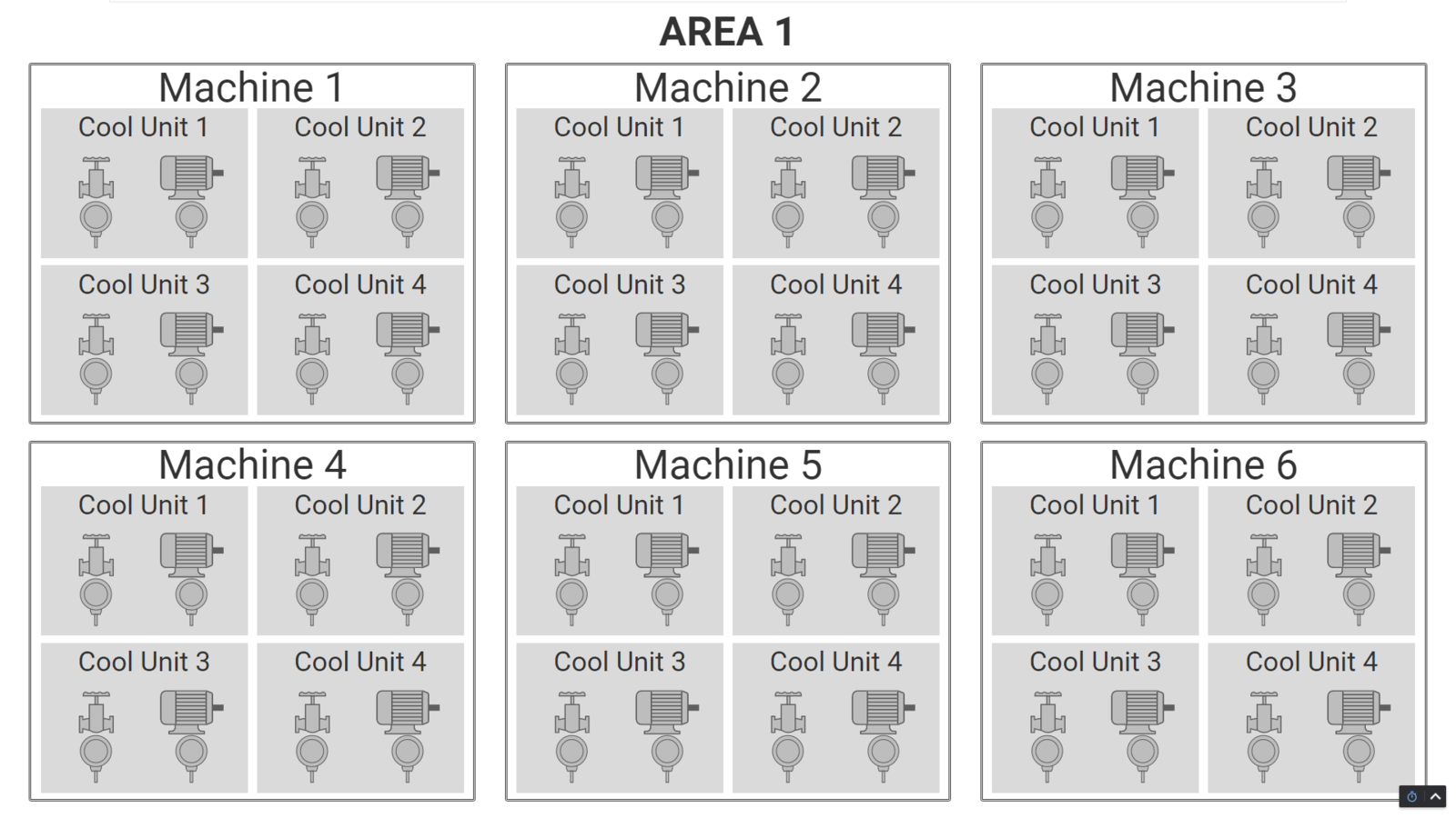
Figure 1: Expected font sizing as viewed on an engineering laptop.
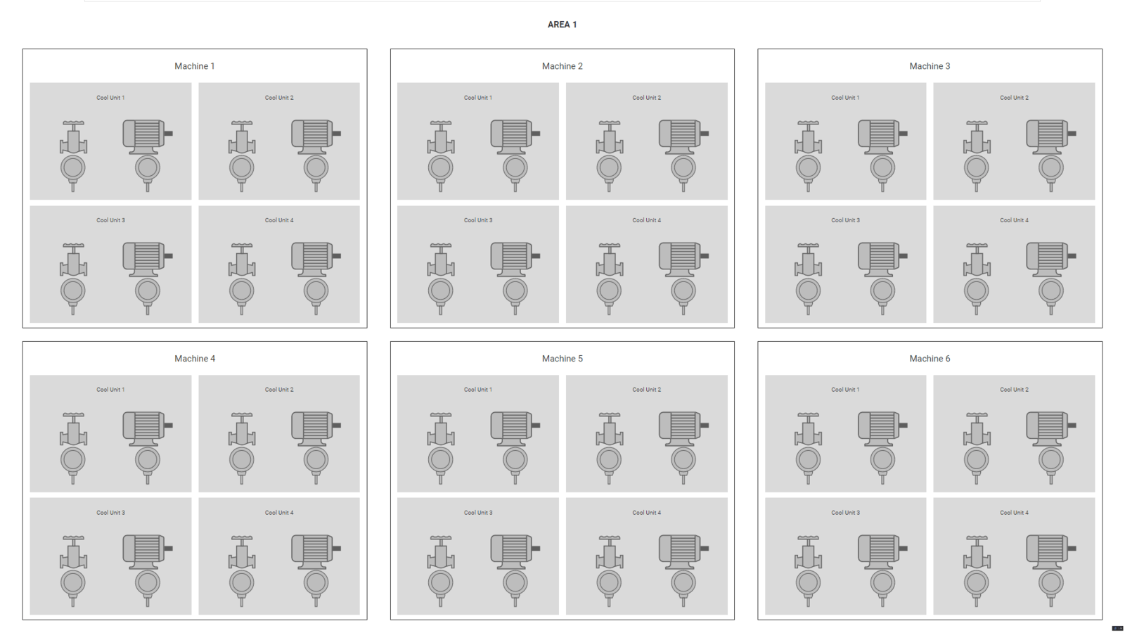
Figure 2: Font size appears too small when viewed on a high-resolution device such as a 4k TV.
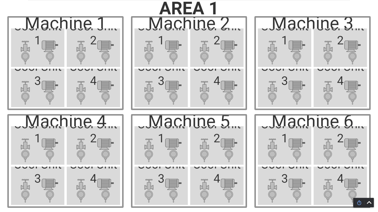
Figure 3: Font size appears too large when viewing the dashboard on a low-resolution device such as a tablet.
Ideally, the size of the font would occupy the same percentage of space on all displays. This way, the dashboard would look consistent given various display resolutions and zooms.
It is critical that the dashboard can be easily viewed on the TV so that anyone on the production floor in Area 1 can quickly get a snapshot of the production status and identify any faulted equipment. Additionally, operators have a tablet to monitor OEE data for their stations and identify recurring faults. Production managers and executives will also want to see the dashboards on monitors and displays in their offices.
Ignition offers several built-in features for handling various display sizes. Flex containers allow components to grow and shrink relative to one another to fill a given space. Breakpoint Containers are another effective way to rearrange components based on the display width or height in pixels. While these container types are ideal for rearranging or resizing components, font size does not automatically grow or shrink with changing container or view size.
CSS for Font Sizing in Ignition Perspective
Luckily, Ignition Perspective uses Cascading Style Sheets (CSS) to style and format its elements (read more about CSS here). Ignition Perspective developers can leverage CSS by styling components individually or by adding global style classes to gain more detailed control of the appearance of their screens. In our case, we can use CSS to yield a desirable font-sizing behavior which is not affected by display resolution or zoom.
The properties of a Perspective component can be found in the PROPS section of the Perspective Property Editor window. When selecting a label component, we can set properties such as the text of the label and the vertical alignment of the label.
We can also style the text or the label by setting the properties of textStyle and style. To modify the appearance of a component, the user can either apply a style class to the textStyle or style, or they can set specific style properties for each component. The fontSize property is of main consideration in this blog.
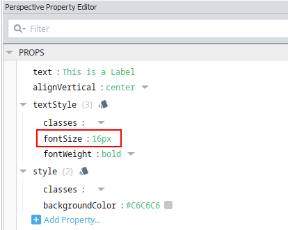
Figure 4: The properties of a component, including the fontSize, can be found in the PROPS section of the Perspective Property editor.
There are several ways that we can size font in Ignition Perspective using CSS. In Figures 1-3, the font size is set in pixels. The inconsistent font appearance is caused by different display resolutions. That is, 16px font size will look much smaller on a display that is 3840 x 2160 pixels compared to one that is 1280 x 800 pixels. Some ways that we can size font using CSS include (see this article for more information):
- Absolute font sizing
- pt – unit of measurement used in print based on one inch (72 pts = 1 inch)
- px – one dot on the screen is equal to one px
- Relative font sizing
- em – 1em uses 1x of the default browser font size, 2em uses 2x of the default browser font size, etc.
- % – 100% uses the default browser font, 200% uses 2x the default browser font size
Unfortunately, none of these font sizing options will solve the problem initially described. More specifically, the font will not occupy a proportional amount of space on displays with varying resolution or zoom. Fortunately, we have another option! We can dynamically scale the size of the font as a percentage of the viewing window, also known as the viewport, using viewport-sized typography. To dynamically scale font size with the viewport, we have a few options for the fontSize property:
- vm – 1vm is equal to 1% of the viewport width
- vh – 1vh is equal to 1% of the viewport height
- vmin – 1vmin is equal to 1% of the smaller of the viewport’s height width
- vmax – 1max is equal to 1% of the larger of the viewport’s height width
Screen resolution is not a variable when using the viewport to size font. An added benefit of using viewport-sized typography is that, when you resize a dashboard’s browser, the font will also resize in real time.
For many cases, just using a factor of vmin for dynamic font sizing will be an effective solution (e.g. fontSize : 2.1vmin). A font size such as calc(0.75*(1vh + 1vw)) is useful because it takes into consideration both the viewport width and height and gives you a scaling factor for different types of labels.
The calc() function is necessary to tell the CSS language that you are evaluating an expression when multiplying by the scaling factor. As a note, fontSize : calc(2.0*(1vh + 1vw)) will yield the same exact font size as fontSize : 2.0vh + 2.0vw. This forum gives a few other dynamic CSS font sizing options.
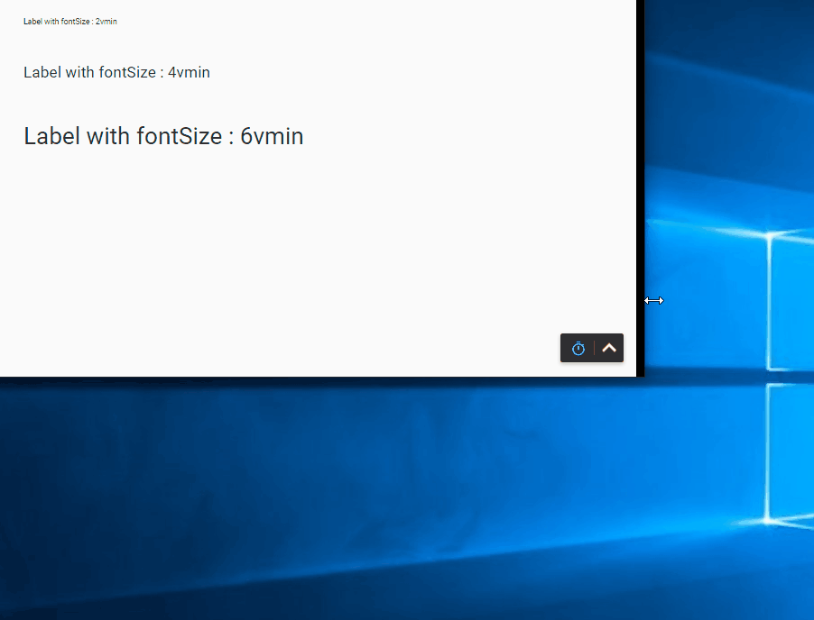
Figure 5: Resizing font based on the viewport size using vmin. Only changing the smaller dimension of the browser changes the font size.
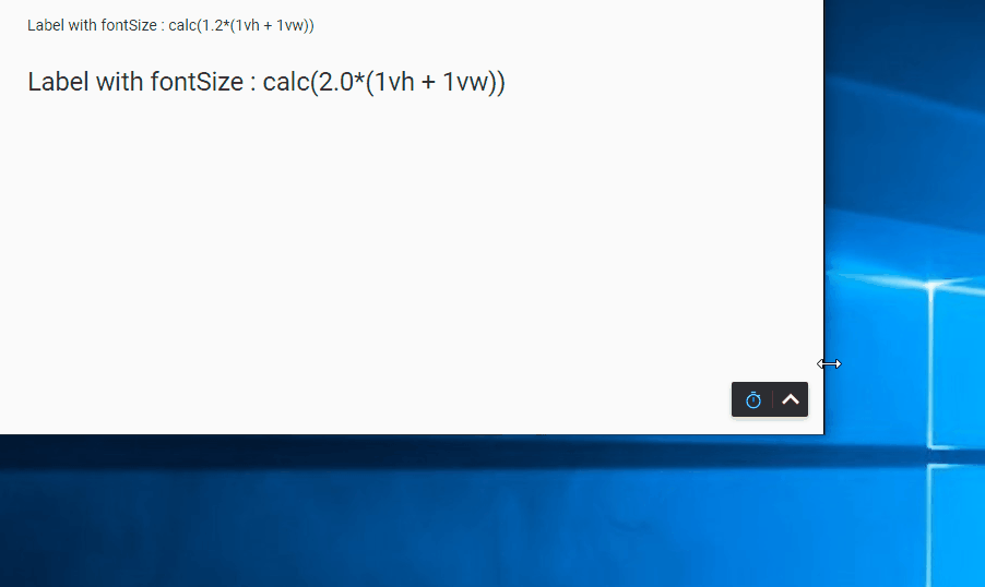
Figure 6: Resizing font using the calc() function as well as vh and vw. Font size changes whenever the viewport changes size.
Strategies for Implementing Viewport-Sized Typography
Now, for the area view shown in Figures 1-3, we can just set the fontSize property to fontSize∶ calc(X*(1vh + 1vw)) and adjust X, the scaling factor, as needed for all labels. But wait… we have one more level of complexity in our anecdote. The customer has also requested a “Plant” page that embeds all four areas of the plant on one view. Before getting into a font-sizing solution, let me first provide an overview of the plant’s dashboard organization.
- Plant (of view, PlantView)
- 4x Areas (of embedded view, AreaView)
- 6x Machines (of embedded view, MachineView)
- 4x Units (of embedded view, UnitView)
Each AreaView has its own page, and there is one PlantView page (assigned to the root or “/” page).
It is ideal to embed the AreaViews so that any changes to them will propagate to the PlantView. This design presents some challenges when using the viewport to set the font size. When embedded, the AreaViews take up a smaller portion of the viewport compared to when they are displayed on their own page. As a result, the viewport-sized font appears too larger on the plant’s page as seen in Figure 7.
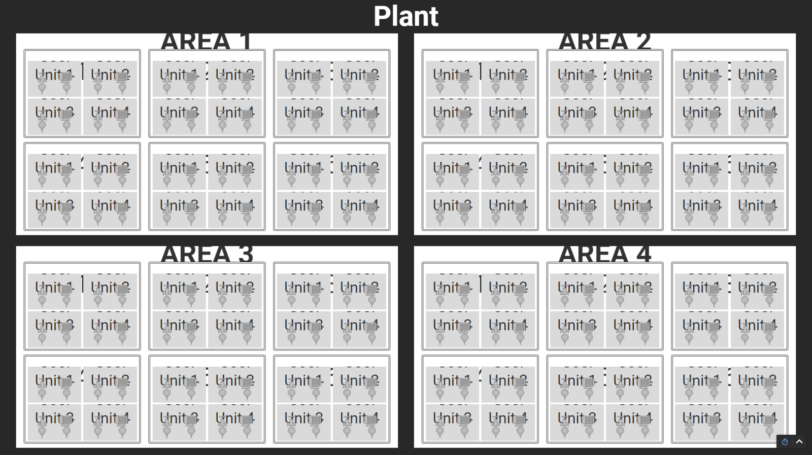
Figure 7: The text on the embedded views appears too large because the font is sized based on the entire viewport — yet, the embedded views only occupy a portion of the viewport.
Ideally, the font sizes within the embedded AreaViews would scale with the AreaViews’ width and height. One implementation strategy is to parameterize the fontSize expression with the width and height of the embedded views such that: fontSize∶ calc(X*({Embedded View Width}vh + {Embedded View Height}vw)).
When using a Percent Coordinate Container, the Embedded View Width and Embedded View Height will be a percentage of the size of the parent view, or the PlantView in our scenario. This expression will “trick” the embedded views into thinking that its viewport is the size of the embedded view and scale its font properly.
When the AreaViews are shown on their own page, we can simply set the Embedded View Width and Embedded View Height parameters to 1, and the font will know to size with respect to the entire viewport.
To implement this, create two parameters on each view that will be embedded on another view — including the UnitView, MachineView, and AreaView. I will name these parameters vpWidthPercent and vpHeightPercent, which represent the width and height percentage of the area views as they appear in the Plant view. Set both parameters to 1 initially.
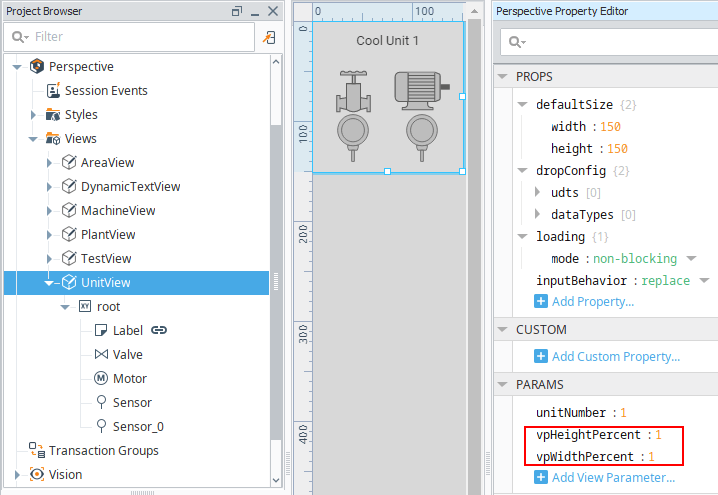
Figure 8: Parameters on the UnitView, vpHeightPercent, and vpWidthPercent, that represent the height and width percentage of the view as it is embedded on a parent view.
Next, create an expression binding on the fontSize property of the label in the UnitView as shown below (I like to click on the hamburger to the right of the text entry area to add parameters).
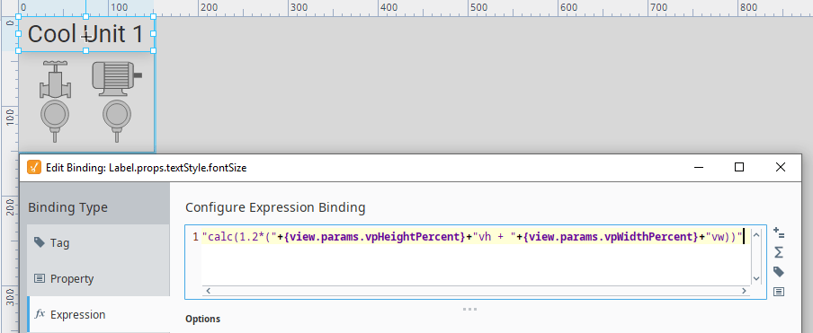
Figure 9: Setting an expression binding on the fontSize property of the UnitView's label.
This string concatenation will yield a fontSize of the following (when the parameters are both 1).

Figure 10: The fontSize property after adding its binding.
Note that font size will not appear correctly in the Designer. To view work, one must launch a session by right clicking on the desired page and clicking “Launch URL” or by pressing F10.
Create the same binding on labels in the MachineView and the AreaView. Modify the scaling factor as needed.
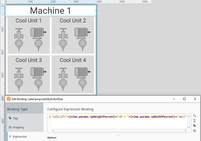
Figure 11: Setting an expression binding on the fontSize property of the MachineView's label similarly to the UnitView’s, except with a scaling factor of 2.
Now that we have fontSize bindings defined, we must use the dimensions of the embedded AreaViews to size font appropriately on the AreaViews, MachineViews, and UnitViews. To do this, bind the vpWidthPercent and vpHeightPercent parameters of the AreaView to its width and height within the PlantView.
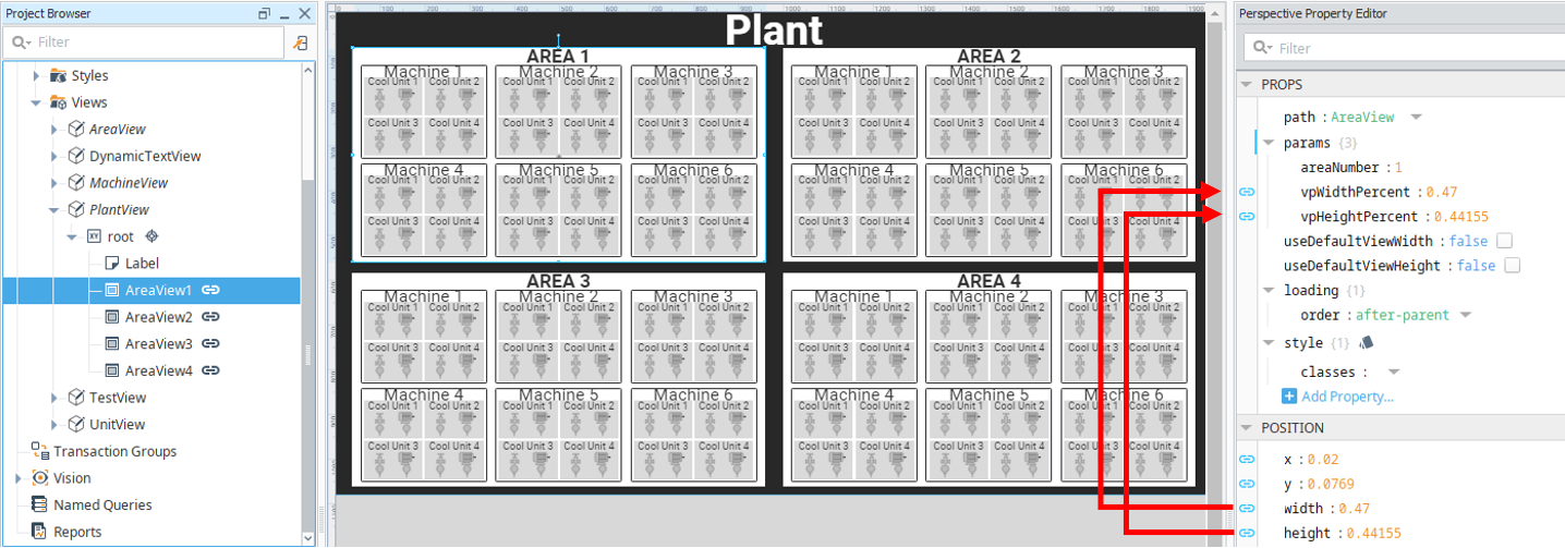
Figure 12: Binding vpWidthPercent and vpHeightPercent to the width and height of the embeded AreaViews, respectively.
Next, on the AreaView, bind the vpWidthPercent and vpHeightPercent parameters of each embedded MachineView to the corresponding vpWidthPercent and vpHeightPercent parameters of the parent view.
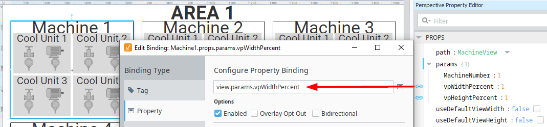
Figure 13: Binding the vpWidthPercent of the embedded MachineView to the corresponding parameter of the parent view, AreaView.
Finally, on the MachineView, bind the vpWidthPercent and vpHeightPercent parameters of each embedded UnitView to the corresponding parameters of the parent view. Now, the font will size independently of the resolution or zoom of the viewing display as seen in Figure 14.
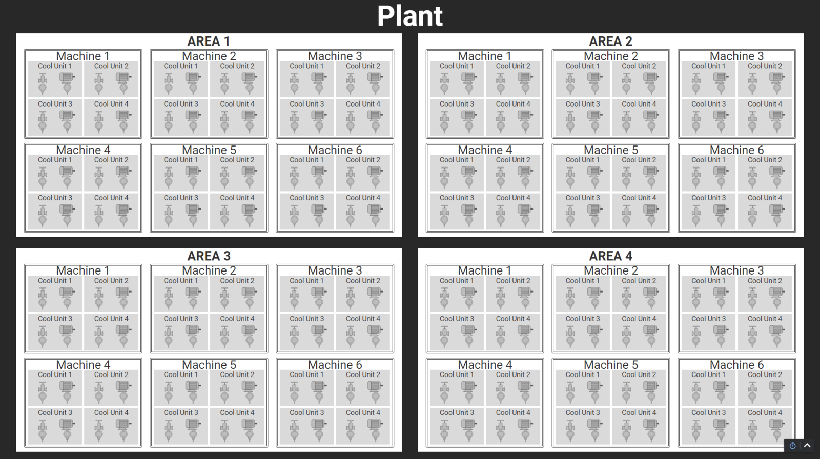
Figure 14: The PlantView's embedded AreaViews display text appropriately after binding the height and width of the embedded views to their vpHeightPercent and vpWidthPercent parameters, respectively.
One other potential solution for embedding the AreaViews into the PlantView would be to use an Inline Frame, or an iFrame for short. An iFrame is useful for embedding a webpage into a view. To do this, link the URL of the AreaView pages to the src parameter of the iFrame.
Each iFrame has its own viewport and, therefore, sizes the font of embedded views correctly. For example, if there were multiple plants and a need for a dashboard with all of them, embedding each of them as an iFrames may be an effective solution. One drawback of using an iFrame is that it becomes more difficult to modify and customize parameters of the embedded view.
Another useful feature of Ignition Perspective is Dynamic Style Classes — which allow the user to set a particular style class based on an element or media property of a view. A Dynamic Style Class would be useful for switching between two font sizes based on the width or height of a view in pixels.
Conclusion
Developing an understanding of CSS will allow you to take the formatting and appearance of your Perspective dashboards to the next level. In particular, viewport-sized typography is a powerful tool that allows text to dynamically change size based of the viewing area.
Learn more about DMC's Ignition programming expertise and contact us today for your next project!