Siemens TIA Portal Libraries have helped me develop PLC and HMI code faster and manage it better. Recently, I have been working with the HMI Styling section of the Portal Library, and I have found it very helpful.
This blog shows some practical examples of using HMI Styling in projects. Specifically, it focuses on how styling can work with the Siemens Open Library. Siemens has released all the documentation you need to get started.
Part 1: The Basics
When you create a Comfort Panel in TIA Portal, it has a default style selected in its Runtime Settings.
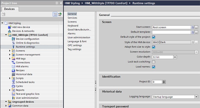
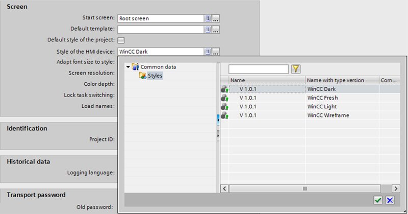
You can change Runtime Settings to several default styles that Siemens includes for free.
I think WinCC Dark is great, but I suggest trying some of the others so that you are familiar with all your options in the future.
Usually, you want all HMIs to have the same style, so keep the “Default style of the project” checked, and instead modify the Portal Project’s default style.
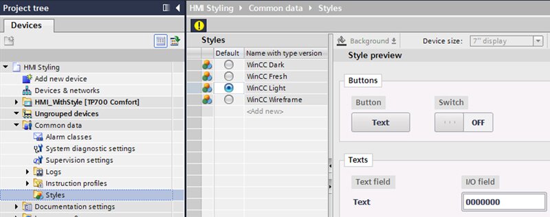
I bet you changed the default style to WinCC Light and started pulling items onto your first HMI screen, but you’re surprised that they look like the WinCC Dark style. That’s because you need to update the Toolbox style to use the device style! Updating the Toolbox style makes it easy to mix and match Dark, Light, Classic, and custom HMI Styles.
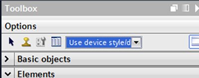
When bringing in objects with “Use device style,” you will notice the object is now linked to the style by default. However, when bringing in any objects with Dark, Light, or Classic, it will not be by default.
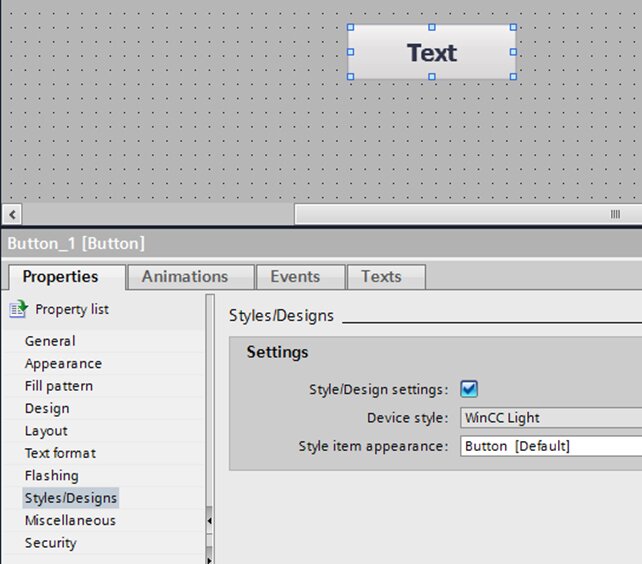
Checking "Style/Design settings" sets many of the properties in the style library preventing modification to Appearance, Fill Pattern, Design, and Text Format.
Part 2: Basic Style
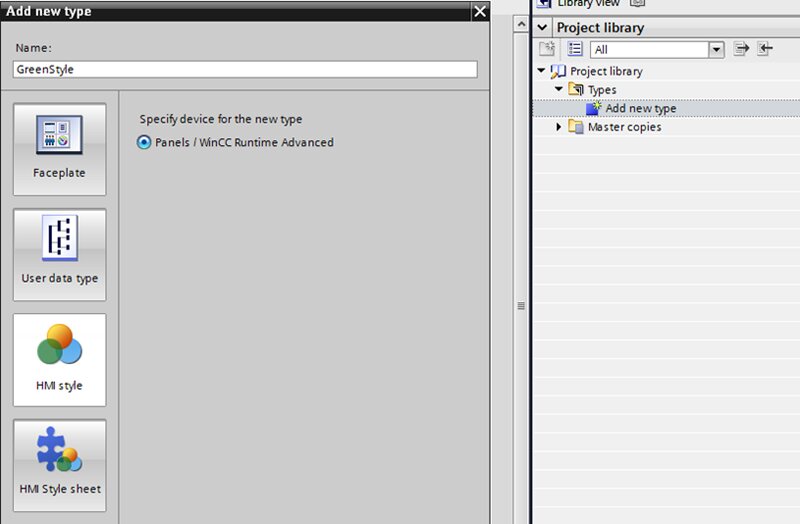
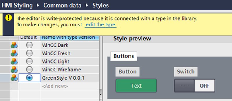
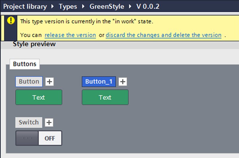
Let’s say you want to have only green buttons on our HMI. A great way of doing that will be to create a new HMI style.
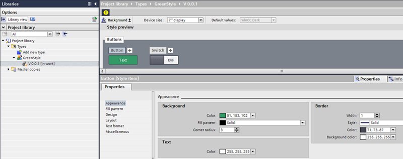
Clicking on the Button, you can modify its Text and Background to match the way you want the green buttons to look.
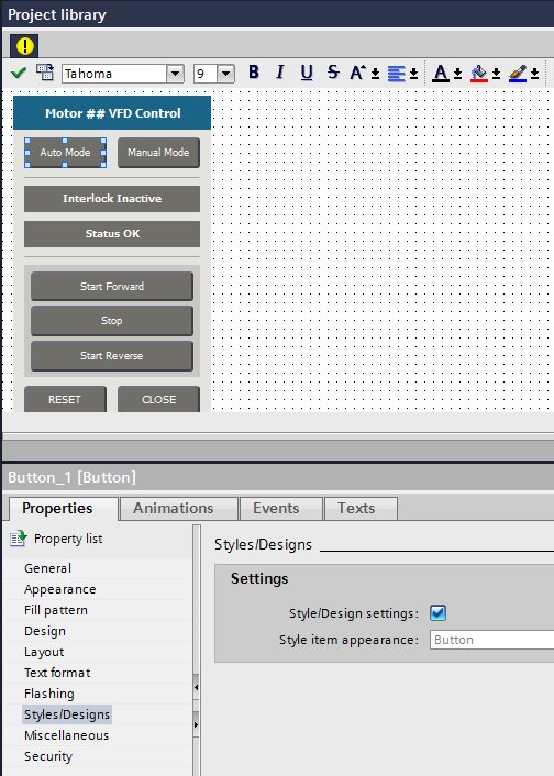
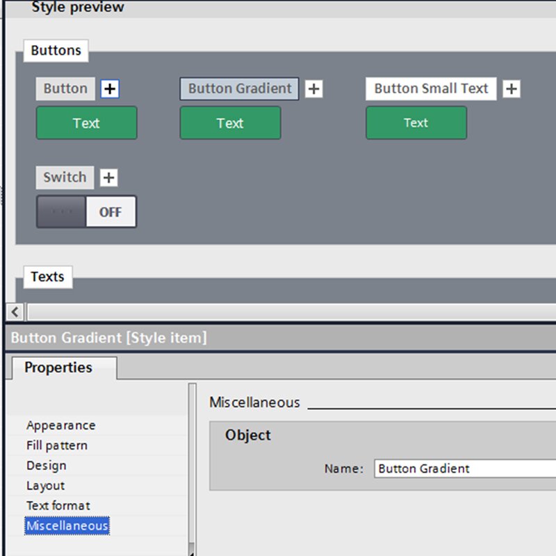
Now let's say you want to use the Open Library Faceplates, but you want them to conform to your styles. Notice that the VFD control does not have a Style check box. So, we're going to need to modify the faceplate.
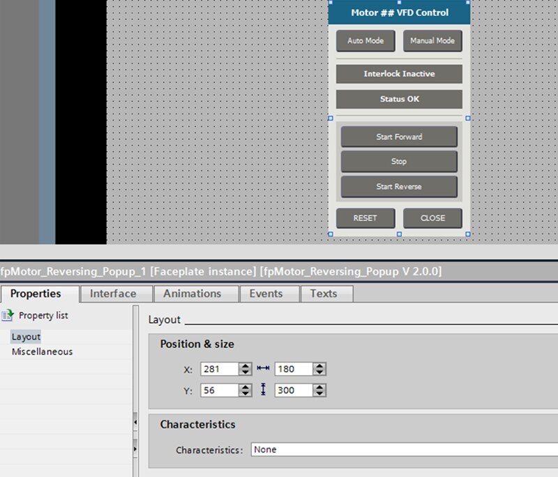
By checking the “Style/Design settings” and typing in the “Style item appearance," you can modify any part of the Faceplate to allow it to use our style. The "Style item appearance" is case-sensitive, so make sure to type it correctly.
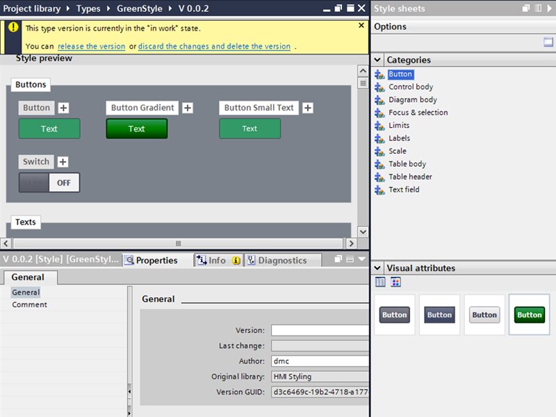
Set the default style of the project to our new GreenStyle.
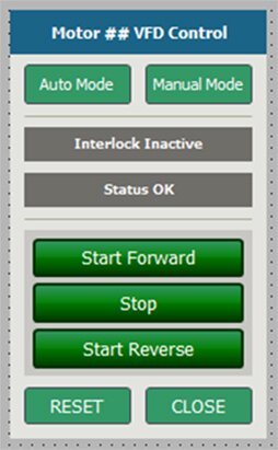
The Faceplate now looks like this!
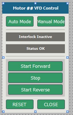
Note that the text for several buttons doesn't fit. With another few Library edits, you can adjust the size, and while you're are at it, jazz up the styling too.
Part 3: Advanced Style
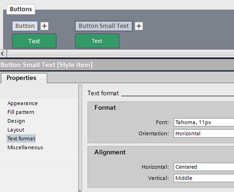
First, create a new button style that has smaller text. Speed up the process and duplicate the Button that currently exists by clicking on the "+".
Rename it “Button Small Text” and decrease the font size.
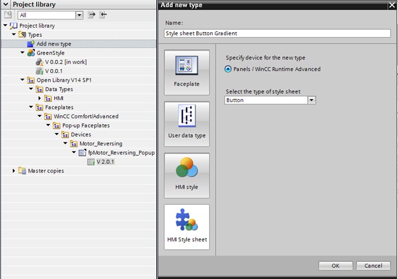
While you're making library changes, create a gradient style button.
I will demonstrate the use of Style sheets while doing this. I have not found Style sheets necessary when creating custom styles for projects yet. There are a lot of types of style sheets, and in this example, I am only creating a button style sheet.
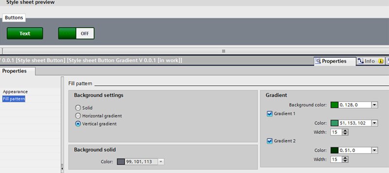
The plan is to use this Style sheet with a green button, so modify the style here for green colors.
Going back to the GreenStyle editor, create another duplicate of the Button and rename it “Button Gradient.”
You may notice the Style sheets on the right side of TIA Portal. If you select the Button category, there are now four styles to choose from instead of three in all other categories. To apply our new gradient style to the “Button Gradient,” click and drag.
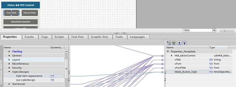
Let's put the new style buttons to work. You'll need to change the styles in the Faceplate. Make the Auto Mode and Manual Mode buttons the “Button Small Text” style and the Start and Stop buttons the “Button Gradient” style. Remember, the style item appearance is case sensitive, so make sure you name them appropriately. See the end-result below.
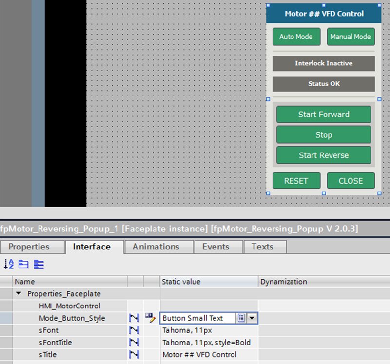
Another method you can use is adding the Style to the Faceplate’s interface. I've dragged the Style item appearance of both the Auto Mode button and the Manual Mode button to the Properties_Faceplate, which allows you to choose the style you want when you use this Faceplate. I also removed the gradient from the Start and Stop buttons because I didn’t like how it looked.
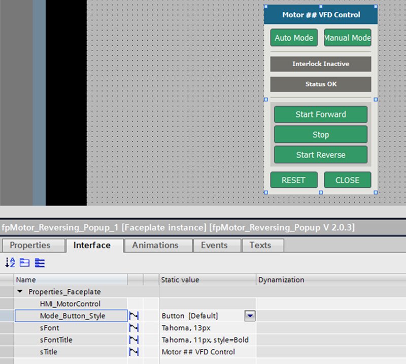
Now when you open the Interface to the Faceplate, “Button” is selected.
When you change the style to “Button Small Text”, you'll see the difference.
I hope you found this helpful for your TIA Portal HMI programming and that it makes the Siemens Open Library more fun to use!
Learn more about DMC's partnership with Siemens.
Contact us for help getting your project off the ground today.